In the years since I published How to do a magazine relay in your newsagency plenty has changed. In this post I provide up to date advice.
Before you start the relay, consider the amount of space you want to allocate to magazines. Do not allocate space to fit what you are sent. Allocate space to make money.
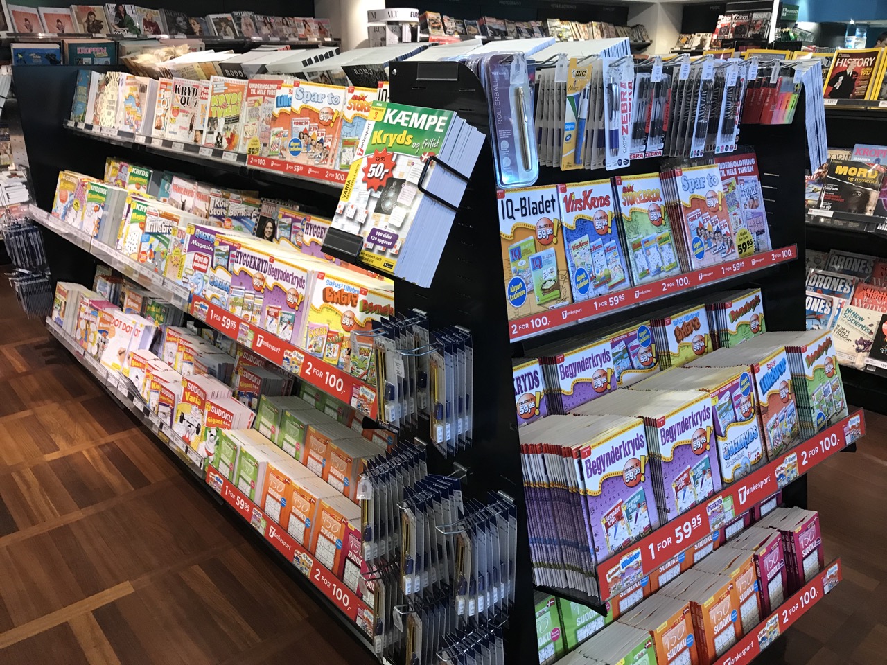
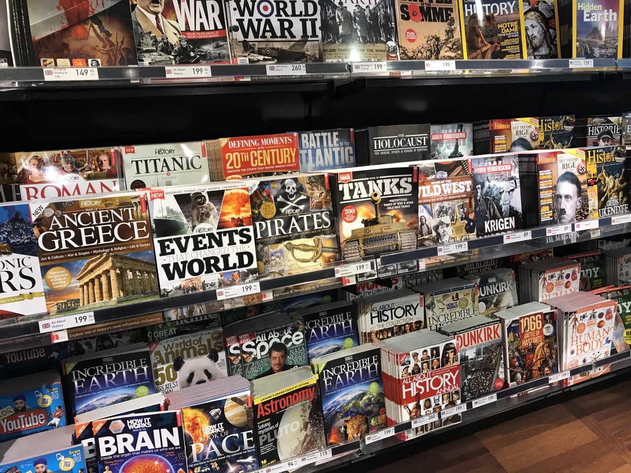
Today, magazines are best located on a wall, ideally at the rear of the shop, such that can be seen from people walking past the shop. A simple MAGAZINES sign above works well.
This back of shop placement, with magazines owning the space can work well as a traffic driver. Where I have seen this move implemented it has not increased the decline in magazine sales.
Ideally you can fit all magazines on the back wall and eliminate all aisle use of magazines.
On to the relay.
The relay you do in your business is your relay. There is no right or wrong way. What I have written here is my opinion, which may be wrong for you.
There is also no end point to a relay. What you do today will need refining next week and the week after. So, do not over think what you want to do as that would be a waste of time.
The goal of the relay has to be to disrupt magazine traffic in pursuit of an increase in sales. What I mean is: change everything, upset customers and staff, sell more magazines as people discover titles they did not know you had.
PLANNING
Map out the wall, determine your zones shopper: garden, food, men, women, sports etc. The categories where I use less than one pocket per title are: special interest, British weeklies, food, comics and some craft segments.
Look at the percentage of sales delivered by each magazine category and look at sales trends for the categories. Tote up broad groups. For example the percentage of sales for women’s weeklies, women’s interests, crafts & hobbies, crosswords, home & lifestyle and food & wine. If your newsagency is like mine, this grouping will account for more than 50% of your magazine sales.
NOW, THE MAGAZINE RELAY
I suggest it is done by one person, an owner, working alone.
- Take every magazine off the shelves. That’s right. Don’t be precious as a jumbled pile gets you looking at the titles and categories differently. Take down all your magazines and all your posters.
- Clean the shelves.
- Start at the centre of the wall and build out. Build the women’s zone. I place this at the heart of magazines, so shoppers see it easily. I suggest you start here as it is the core from which all else flows.
- Place a half or full column of crossword titles next to weeklies.
- Next to weeklies place, in order, pockets of Better Homes and Gardens followed by Australian Women’s Weekly, British women’s magazines (yes, all of them), country living titles, home and living titles, food, wedding with a waterfall of the major title and hair. For me, space wise, that sees out one side of the aisle.
- Then, I have fashion young, fashion older and I end this with a waterfall of Frankie. Next is women’s health starting with younger target titles and blending to older ones. Next is pregnancy and baby followed by crosswords. This usually rounds out that side.
- Create sections, where the titles demonstrate clear zoning. But don’t be generous on space allocation as space costs money.
What I do in women’s is the same for the other zones I create. I do each zone separately and try and get into the head space of the shopper of the zone – using the most popular titles to act as beacons, or signposts, for the zone.
I am careful what I place next to top selling titles. This is a prime spot, next to the popular titles. Choose wisely. Choose titles that naturally fit next to the big titles, titles shoppers are likely to browse and purchase on impulse.
If I am not sure about where to put a title I put it aside and move on.
I take extra time with special interest and hobby titles. For example, I put railways and model railroad titles near each other but I am careful to ensure that they are separated as they appeal to two shoppers and only occasionally do you see titles from both segments in the same basket.
Within the zones I look for and respect specialisation. For example, within men’s lifestyle and sports I create a clean space for the quality serious fitness titles like Coach, Men’s Health and Men’s Fitness.
REVIEW, FEEDBACK, FOLLOW UP
You’re not done when you think you are done. Track sales, listen to your team and your customers. Tweak where you feel it is necessary.
Bring new issues to the fore. Continue to be engaged in how your magazine department looks.
Continue to look at your sales data. If there is no lift be open to further change.
FINAL WORDS
Doing a magazine relay can be like doing one of those kid’s puzzles – you move them around and around until you have the completed image. That image can look and feel like a work of art once you are done.
While some readying this will be tempted to say why bother, we only make 25%. Get the relay right and sales will increase without any extra capital investment and with a lower retail space allocation. That is a win in my view.
If you have made it this far, thanks for reading. Magazines really are a point of difference which we need to work harder at embracing – despite the challenges of the distribution system.
I’d be happy to answer questions or discuss magazine relays with anyone: mark@towersystems.com.au or 0418 321 338.
Over to you…