A blog on issues affecting Australia's newsagents, media and small business generally. More ...

visual merchandising

Brilliant chocolate party platter
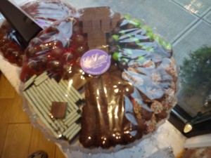
If you love chocolate, a visit to New York is not complete without a visit to Li-Lac Chocolates. This is chocolate at its best. All made by them from chocolate bars to works of art like high heel shoes to the chocolate party platter in the photo. Indeed, it’s the party platter that interested me to most this visit as it put chocolate in a different light. Whereas I’d think of Li-Lac as a place to shop for a gift or guilt pleasure, here is an excellent packaged product for an office or a party, a product I’d never thought of before. Brilliant.

Another reason to love this business is their tag line, their USP, Stubbornly old fashioned since 1923.

They have remained relevant by creating new designs and adding new flavours.

I love chocolate.
6 likes
retail

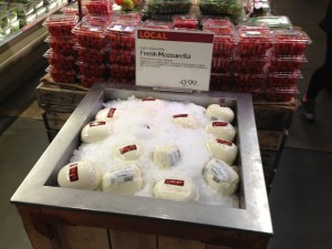
Driving impulse purchases of cheese

Something else impressive about Whole Foods Market is their placement of products outside their usual location. In several of their stores I noticed these ice-packed dump-bins with cheese … next to fruit and next to vegetables. This is an excellent idea for driving impulse purchases, something we could do more of in our busy newsagencies.

Whole Foods don’t follow the Australian tradition of wide aisles and keeping products in designated areas.

2 likes
visual merchandising

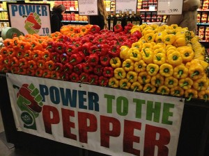
I don’t eat peppers but I wanted to buy some

No, I don’t eat peppers but I sure felt like buying them when I saw this display when I visited a Whole Foods Market at Union Square in New York yesterday. From the power to the petter sign to the colourful display with is excellent visual merchandising.

Based on what I have seen this trip, this display is a Whole Foods Market standard for peppers.

Click on the image for a larger version.

5 likes
visual merchandising

A new approach to displaying bananas

I was fortunate to get to a Whole Foods Market store on the Upper West Side of New york yesterday. I went having heard their CEO speak earlier in the day. I wanted to see if his pitch carried through to the shop floor. It did. Whole Foods is an excellent model, I took plenty fro  what they do … many ideas.

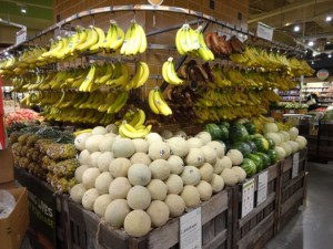
One such inspiring idea is how they display bananas. They hang them, as the photo shows.  This different approach to presenting merchandise plays out through the store. I can see how it would make shopping more enjoyable.

Not only do they hang their bananas, they have a wide range and provide excellent information with the range.

While the supermarket is drawing on a population much bigger than we see locally in Australia, there are many Whole Foods Market stores service Australian size populations.

Walking out of the store I was thinking that I had not expected to see a fresh (to me) approach to displaying bananas. Just goes to show innovation has no bounds.

4 likes
visual merchandising

Nice Valentine’s Day display

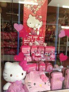
Check out the Valentine’s Day themed window display in a Sanrio store here in Las Vegas.  While it is specifically promoting Hello Kitty product (which is huge here) it could be promoting other plush.

Beyond being eye-catching, this display is terrific because of its simplicity. It’s something any of us could create in our newsagencies with the right product mix. The display is something anyone with only basic VM skills could put together.

1 likes
visual merchandising

Time to rethink lighting in your newsagency?

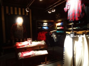
I am seeing more retailers use lighting, darkness actually, to great effect. I was in a Hollister store this week, in the US, and their use of darkness is excellent.  The store is made up of a series of small rooms, each with a two or three spotlights.

What I like about the Hollister use of darkness is that it adds to the feeling of stepping off the street or out of the mall and into a completely separate environment. It’s very conducing to shopping.

While darkness would present challenges for newsagency businesses, it is something we could use in certain parts of our stores where we want shoppers to really immerse themselves in certain products that require different feelings. For example, some gift and homewares lines lend themselves to this as would the occasional seasonal offering.

In most newsagencies today, the lights are either on or off. Maybe it’s time we played with this.

4 likes
retail

Wonderful back to work visual merchandising

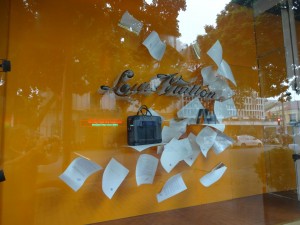
Check out the back to work window display being rolled our by Loius Vuitton stores. It’s visually stunning – like all their window displays. It is also perfectly connected to the season without being all about price or looking boring like most BTS VM displays look.

While Louis Vuitton sells high end bags with excellent margin, I do think we can learn something from this display. It presents a strong visual connection with the season which is enjoyable.  Like any good display, your eyes are drawn to this window.  That’s the first step to getting you ton consider the products on offer.

We often judge our displays against other displays in newsagencies. I think we need to judge them against other retailers as these are our real competitors. This is where we, each of us individually, need to make visual merchandising choices that are appropriate to our specific business situation.

For example, do we display to compete with a supermarket? … a department store?  …  a card shop? …  some other specialist retailer?  I think these are interesting questions as I certainly believe that the days of displaying in ways traditional to newsagencies are no longer relevant to us.

Click on the image for a larger version.

6 likes
visual merchandising

Promoting new season arrivals

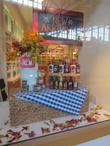
I was going through some of my 2012 photos and found this one which I thought newsagents would find interesting. It’s from a homewares and gift store in a mall in Denver in October this year.

The setting of the new products on what looks like a hay bale and a chequered table cloth makes for an eye catching and professional display. I also love the NEW ARRIVALS sign, it makes the point of the display very clear.

Click on the image for a bigger version.

5 likes
retail

Sheldon from Big Bang Theory is our magazine beacon

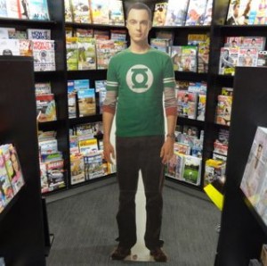
We have enlisted Sheldon from the Big Bang Theory hit TV show to draw attention to our men’s magazine area right at the rear of the store. This is another of the cardboard cutouts from the range we had success with during Halloween.

We chose Sheldon from the mix of life-size cardboard cut-outs in stock because of the popularity of the show among males and because no other store in or near our centre will have this life-size Sheldon cut out. It’s a perrfect gift for fans of the show and an ideal beacon to draw shoppers, particularly male shoppers, to the back of the store … once there they will see magazines we think they will like.

Playing with products that challenge the traditional newsagency model is important for us for our future.

For any newsagents interested, we sourced the cardboard cut-outs from: Alternative Distribution Pty Ltd in Victoria – 03 9334 5857. FYI, I don’t have a deal with them.

9 likes
magazines

Making the most of product tags

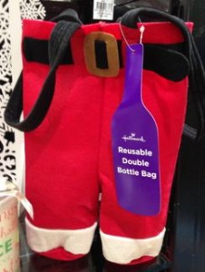
One of the important tasks when tidying on the shop floor during busy seasons such as christmas is to ensure that all product tags and labels are set to fully inform shoppers. This makes browsing easier and, with an especially good tag, improves the chances of sales success. Take the tag for this bottle bag from Hallmark – if the tag was left inside the bag browsers not taking notice might miss what the product actually is. The shape of the tag and the text make browsing the item easier and enhance the prospects of purchase.

So, we ensure that our team members know to not only tidy products but also ensure that useful tags, like this one, are showing.

1 likes
Gifts

Stunning window display

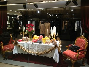
I love the window display I saw for a fashion outlet in Hong Kong on the weekend. Shoppers like me stopped to admire it as if it was a work of art.  Click on the image to see the detail. While I don’t have space for something like this in any of my newsagencies, I have been thinking about how I could achieve something even close with some reconfiguring.

What I especially like about the display is the setting showing an outcome for what the store sells. Their clothes would be ideal for attending a dinner like the one featured in the display.

7 likes
visual merchandising

Driving volume sales of Christmas decorations

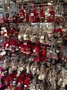
I  noticed this hang-sell display of Christmas decorations yesterday. It’s a volume, mass merchant, approach. I was drawn to the display from 30 or so metres away because it looked like there was a big range on offer. It looked more bold than the photo suggests.

This is the approach I am thinking about for next year. Going out early and taking more of a mass approach than the boutique approach taken this year with Christmas decorations.

3 likes
visual merchandising

From inside the doorway of your newsagency what do you see?

I was in a newsagency this afternoon and what I saw four different marketing messages on posters hanging form the ceiling, five different brands being promoted with signage on the walls and more brands (mastheads) partially obscured by boxes.

Posters, branding and signage should only be there to drive sales. They should be current and relevant to our shoppers. The more you put up the less visual value achieve for each.

A single poster by itself will most likely be wasted visual noise and achieve nothing for you or the brand you are promoting.

I have seen situations in newsagencies where fewer posters and signs result in sales growth.

I urge newsagents to stand inside their door today and see what they are presenting to their customers. Remove unnecessary visual noise, take down signs, posters and the like that have been up more than a couple of months – except for the brand of the store itself. Old signs make your shop look and feel old.

The owner of the newsagency I was in did not realise the number of old messages facing shoppers.

7 likes
Newsagency management

Stunning Cosmopolitan Bride display

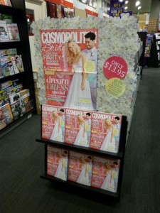
I love this display created y the team at one of my newsagencies to promote sales of the latest issue of Cosmopolitan Bride magazine.

I like the detail reflected in the display, how they have provided a wonderful backdrop that holds up the magazine as the hero and connects with the prize opportunity available with this issue of the magazine.

Click on the image for a larger version.

4 likes
magazines

Nice looking Cleo

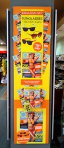
I love the bright look of the latest Cleo magazine. The terrific cover and bright collateral accompanying it was reason enough for the team at one of my newsagencies to place this out the front, facing into the shopping mall.

I love how they personalised the display with orange and yellow card and used the cover run-ons at the sides to add impact to the display.

While on the weekend I said newsagents should free their team members to create displays without using supplier collateral, this display is an example of excellent use of the collateral … especially since it brightens the mood in the middle of what has been a cold Spring.

7 likes
magazines

Beanie Kid Christmas floor unit working well

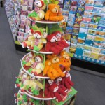
I love the floor unit for the Christmas Beanie Kid range. Shopper reaction is that it’s not too early to have this on the newsagency shop floor – I thought it might have been given that we are full up with halloween, diaries and calendars and only have 135 sq m to play with. We have the unit placed to interrupt flow and it’s working a treat – it’s part of our basket building work to drive basket depth.

0 likes
visual merchandising

Freddy Krueger boosts Halloween display

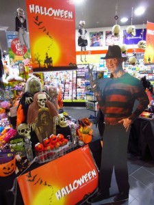
Introducing the life-size Freddy Krueger cut out to our Halloween display has helped further boost attention. The photo shows less than half of our total Halloween display. Freddy is located between the two main tables.

In addition to halloween party and dress up goods, we have Freddy available for purchase as a centrepiece for an in-home or office Halloween display … yes, offices are getting into Halloween as it’s a fun season to lighten the office.

3 likes
marketing

Clever visual merchandising Apple

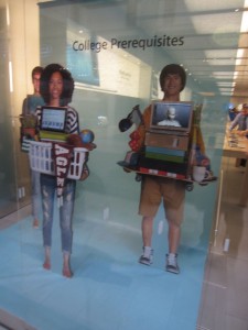
Check out the clever back to college window display I saw at an Apple store here in the US yesterday.

Click on the image to see the detail of how they place their product.  Nice!

Like everything they do, this window display is clean, on-topic, eye-catching and focused on driving sales.

While we don’t sell these products, I take inspiration from the display.

2 likes
visual merchandising

MANSPACE magazine as the Father’s Day feature

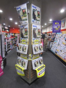
MANSPACE magazine is the perfect gift for any dad on Father’s Day.  We have placed it as the backdrop for Father’s Day cards and gifts.  Shoppers looking at these will definitely see the magazine.

Other shoppers entering the business will also see MANSPACE magazine because of the high profile location and that we have ensured no visual clutter around the display.

We have deliberately gone for a display on both sides of the column so we are seen by shoppers entering through the two main thoroughfares into the business. Click on the image for detail.

We also have the magazine in what we call our thinking man’s section.

MANSPACE magazine is important to newsagents as it’s a special interest title the kind of title to drive traffic to our businesses and to underscore our point of difference.  Newsagents who do not specialise in magazines and do not have any other product or service specialisation risk seeing their business performance decline.

Bricks and mortar retail today requires specialisation. The easiest specialisation for us right now is magazines.  MANSPACE magazine is a good fit with this plan.

7 likes
magazines

Sunday management tip: managing magazine posters

We keep our magazine posters for a couple of weeks for monthlies and a full week for the weeklies.

We do this because we will often want to create a display or setup some in-location feature some days or even a week or two, in the case of a monthly, after the on-sale.

Keeping the posters enables us to do this, to create a display after the title has been out for some time.

I have been surprised to discover that some of the newsagencies I have been into recently do not have a process for keeping and managing magazine posters.  I’d urge newsagents to do this – set aside a place and make someone responsible for regular culling but also keeping collateral for a set time so that you can make the most of space and other opportunities you discover.

magazines aren;t a chore or an obligation in my view. They generate excellent traffic. Being creative and unique with the type and timing of displays is another way of showing off a point of difference.

8 likes
Newsagency management

Nice looking VTAC GUIDE

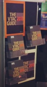
I like the look of THE VTAC GUIDE 2013. Visually, it’s a nice departure from past guides.  The new look has given the team in one of my newsagencies an opportunity to take a more stylish approach to promoting the title.

Stylish is not word I’d use in considering past VTAC GUIDES. This year is different and it looks good. This is important in retail in that we like to sell products that look good. This one does.

So, we are going out early with the THE VTAC GUIDE 2013 out the front of the shop somewhere people can easily see it and visit the shop as a result. The display in the photo is facing into the mall where passers-by can see.

7 likes
visual merchandising

Promoting Women’s Weekly Diamond Jubilee special edition

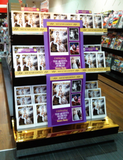
We are going all out promoting The Women’s Weekly Diamond Jubilee Special Edition.  This is the photo of a terrific display by the team at our Watergardens store. It’s at the front, facing the mall.

I love the choice of gold for the base of the display and how the poster is placed in the middle.

This is a title for newsagents to go hard with from day one.  We have a brief window to grab sales.

0 likes
magazines

Smart collateral from ACP for Slow Cooker 2

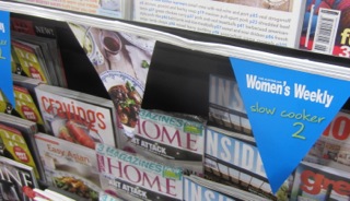
I like the flag style collateral from ACP for promoting the new Slow Cooker 2 cookbook. It’s different and enables newsagents to use it in a variety of clever ways to promote what should be a top-selling title.

Since newsagents have the title a month or so before any other retailer I’d suggest newsagents make sure they are leveraging the opportunity with the collateral.

0 likes
marketing

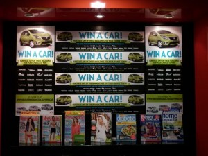
Last week of the WIN A CAR promotion

In this last week of the WIN A CAR promotion being run by Pacific Magazines the team at one of my newsagencies has gone all out with this terrific behind the counter promotion. It’s visually striking and singular in its message. It promotes some of the titles connected with the promotion without getting in the way of the promotion of the prize.

Click on the image for a bigger version.

0 likes
magazines