A blog on issues affecting Australia's newsagents, media and small business generally. More ...

visual merchandising

Visual merchandising advice for newsagents who think they know northing about visual merchandising, and for blokes who always try and get out of creating a display

Everyone can do VM!

Visual merchandising is about display products in a way that attracts people to them, top look, touch and feel. Ultimately, it is about displaying products so you sell more.

Anyone can do visual merchandising.

Here is our advice.

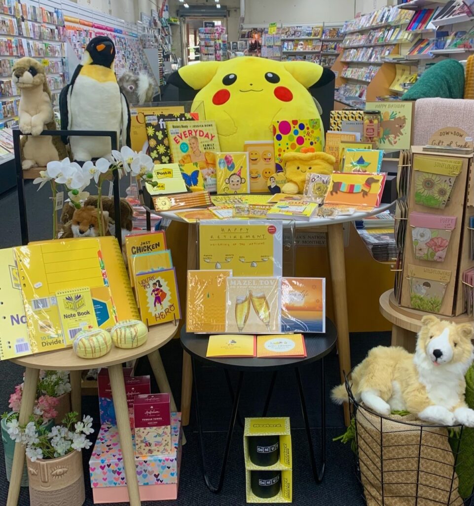
  1. Start with a clean space, a flat surface, in a good location.
  2. The best display looks like a pyramid.
  3. Your hero product is at the top of the pyramid.
  4. If the display is for a season or some other sign-post event, the poster should be placed with the display so shoppers can see it without having to look for it.
  5. Flowing from the hero product down to the base of the display are other products. But not so many that you can’t see what you want people to see.
  6. The display is balanced, even.
  7. A display of gifts always includes cards.
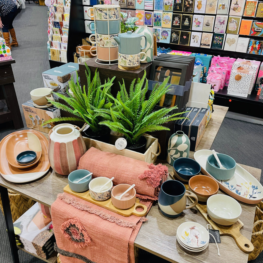
  8. If the display is promoting homewares the pyramid approach is not needed. Instead, go for something that looks more natural, like in the home.
  9. Use coloured paper to highlight certain products. But don’t go for a rainbow.
  10. From a colour perspective, a good display has no more than two core colours as the focus.
  11. A display can look untidy and that is okay in some circumstances. For example, a box of Beanie Boos exploding from a box .
  12. Mistakes are okay.
  13. Oh, and don’t treat this as an engineering challenge. Keep it simple and fun! :

Take your time, have fun.

Remember, the alternative is no display at all.

A note to others who may be around when someone is doing their first display – we all did our first display once … be gentle.

Now, here are some more notes about displays:

In my opinion, the best displays have a narrative relevant to the business, a story or purpose. This is code for saying I am not a fan of single product or single supplier displays. suppliers love these, of course, as they are a billboard for them. What suits them will likely not suit you.

A good display is a collection of items from multiple suppliers, categories and segments that make sense together, from which a shopper could choose several for a gift, or for themselves. Choosing the items for the display us you curating the display, making editorial choices to tell the story you want to sell.

Don’t leave the display up for long. My advice is one week, two at the absolute maximum. Having a length of time for which a display will be live helps you allocate appropriate time for the creation of the display. if you are not sure how long to spend on it, set yourself and hour tops. Get it done within that time.

Once you’ve done a display, if you are new to this, ask for opinions. Learn. Each display will be an improvement on the last.
Whole the opinions of others can be nice, what matters from any display is the sales it achieves for you. be sure to track this as that data will inform your next choices.

11 likes
Management tip

Colour blocking can challenge newsagency shopper expectations

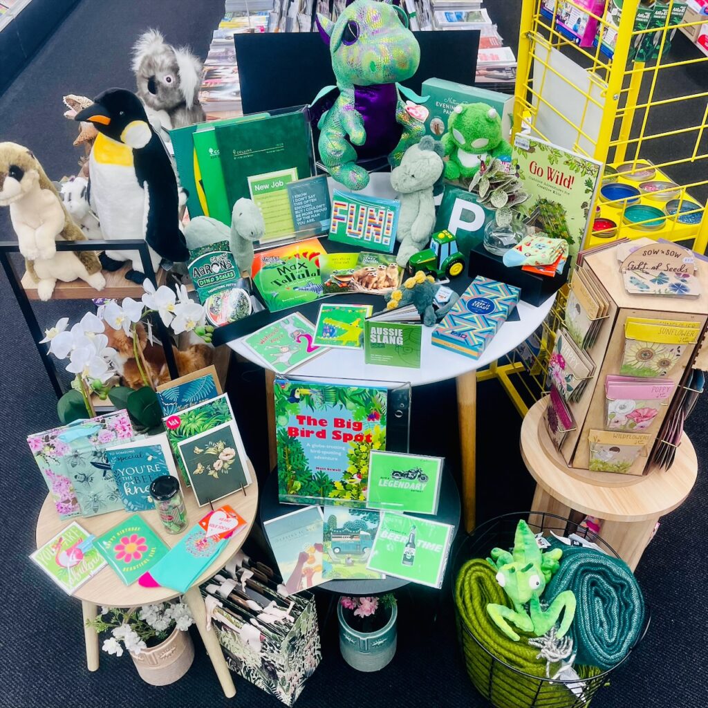
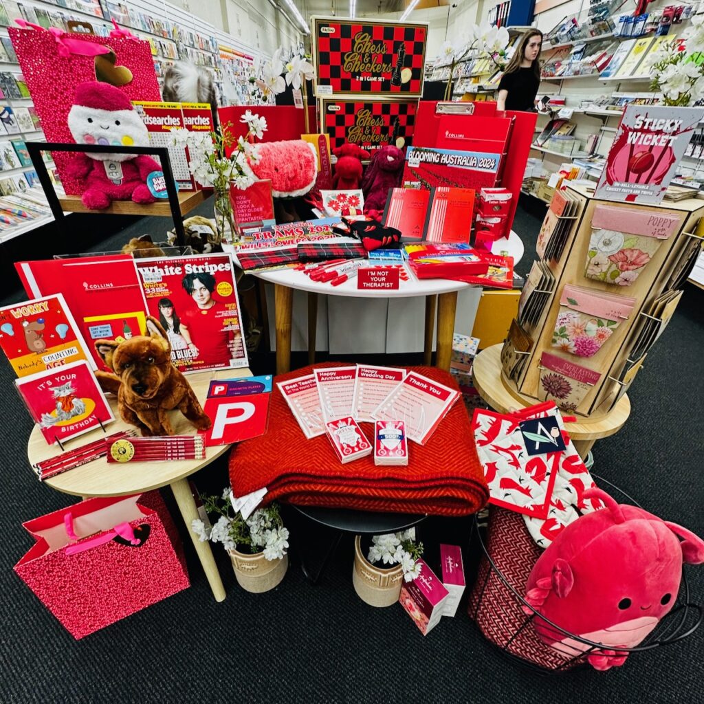
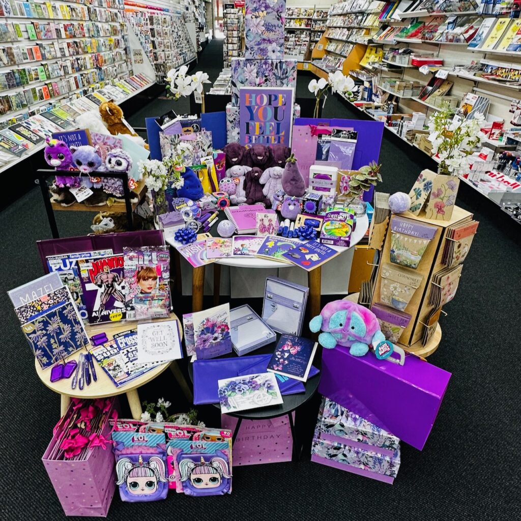
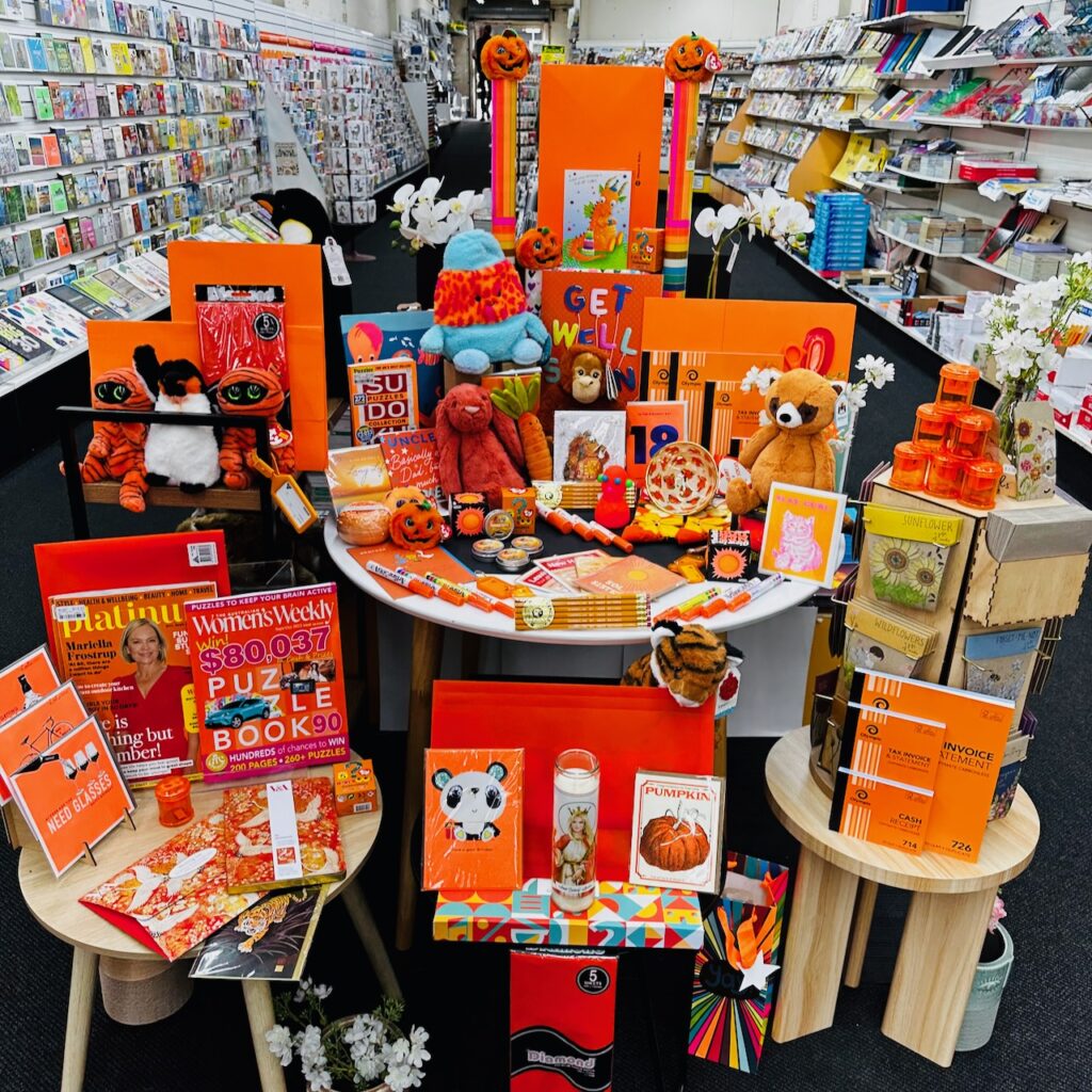
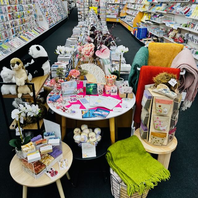
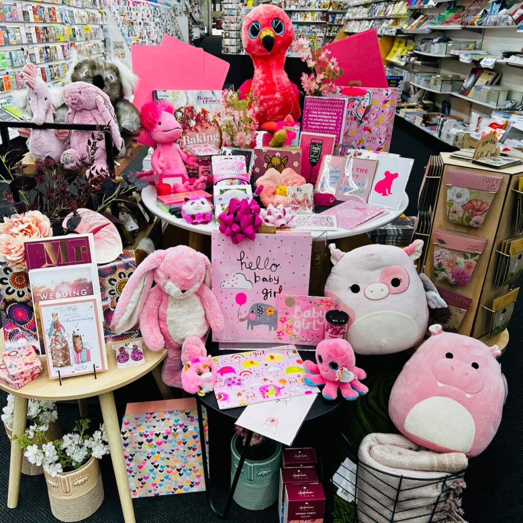
We have been grouping products by colour in one of my newsagency shops. The only rule is that every product in the display has to represent the colour of the week. This week, it’s pink:

If you zoom in you can see the variety of products: manila folder, marker, plush, cards, gifts, soap, jewellery, sensory putty, luggage tag, gift bags, seeds, journals, books and candy. That’s a key point here – the diversity of products that are at home in a colour specific display like this.

We have the display situated so that everyone entering the shop through the front door sees it. You can also see it from out on the street.

This is the fourth week of this colour-wave pitch. We don’t purchase products for it. Everything is from shop floor stock.

Anyone can do this. And, because the colour is the feature, you don’t need to be a visual merchandising whiz to make it work. It takes around 10 minutes to choose products and create the display. This time note is important as it reflects our approach of not overthinking things.

We leave the display up for no longer than a week, which ties back to my advice to not overthink this.

The shopper reaction has been terrific.

Now, if you do try this – it may take a couple of weeks, a couple of colour blocked displays, for shoppers to engage, or even comment. This is not, initially, about sales. rather, it is about products being noticed, change being noticed, things in the shop other than the destination purchase being noticed.

In case you are wondering, here is our first one: yellow.

And, here is our second one: green.

Have a crack, it’s easy, and there is no inventory cost. There’s a bonus of the person doing it learning more about products in the shop.

12 likes
visual merchandising

Another newspaper stand bites the dust

We moved newspapers from front of store prime position in the newsagency to a side wall barely a metre away, a less expensive space, less visually disruptive.

This is in a newsagency we bought in December 2021. We’re making changes slowly so as to not disrupt valuable regular shoppers and to do so within a tight capex budget – we are frugal when it comes to making changes in the shop.

Our shop floor location and space allocation is guided by GP contribution. Newspapers in this business generate around $15,000 in GP. This does not justify the prime position they had occupied in this shop for decades.

We will experiment with the freed space over the next couple of months to find the categories that work best, and cycle through them with changes every week to keep the visual offer fresh.

As the photo shows, our preference is for visual variety in colour, shape and size. This provides flexibility as to what we display here. This particular display is centred with self care and around that is allied products we think will appeal to the same shopper.

The big magazine unit behind this space is safe for now as it delivers north of $450,000 in revenue for the business.

Back in the day we would have brought in a shopfitter to completely overhaul the shop and spent $150,000+ more doing this. Today, our approach, and our advice to newsagents is – make changes over time, to give the shop a feeling of perpetual motion (change), do the changes yourself, or use a handy person – certainly not a shopfitter.

My point is – anyone can make changes like this in their business. Do it on a budget. Do as much as you can yourself. measure the results. Keep at it, keep making changes.

19 likes
Newsagency management

The Kanye West / GAP clothing collaboration is dark, messy and odd

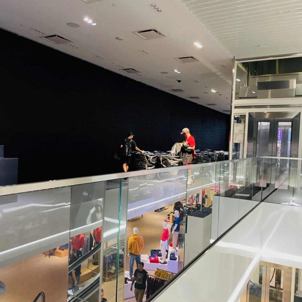
I got to visit the GAP flagship store in Times Square, New York, a few days ago and see, first hand, the Kanye West clothing line launch that has been mired in negative press recently.

Upfront I need to note I am not the customer. But, I am a retailer. This felt like staged theatre, that had miss-stepped.

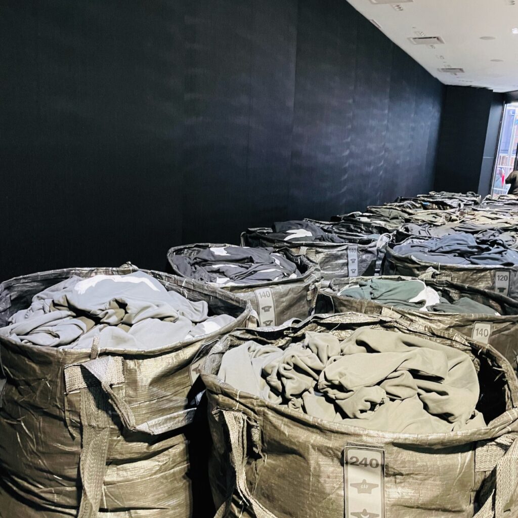
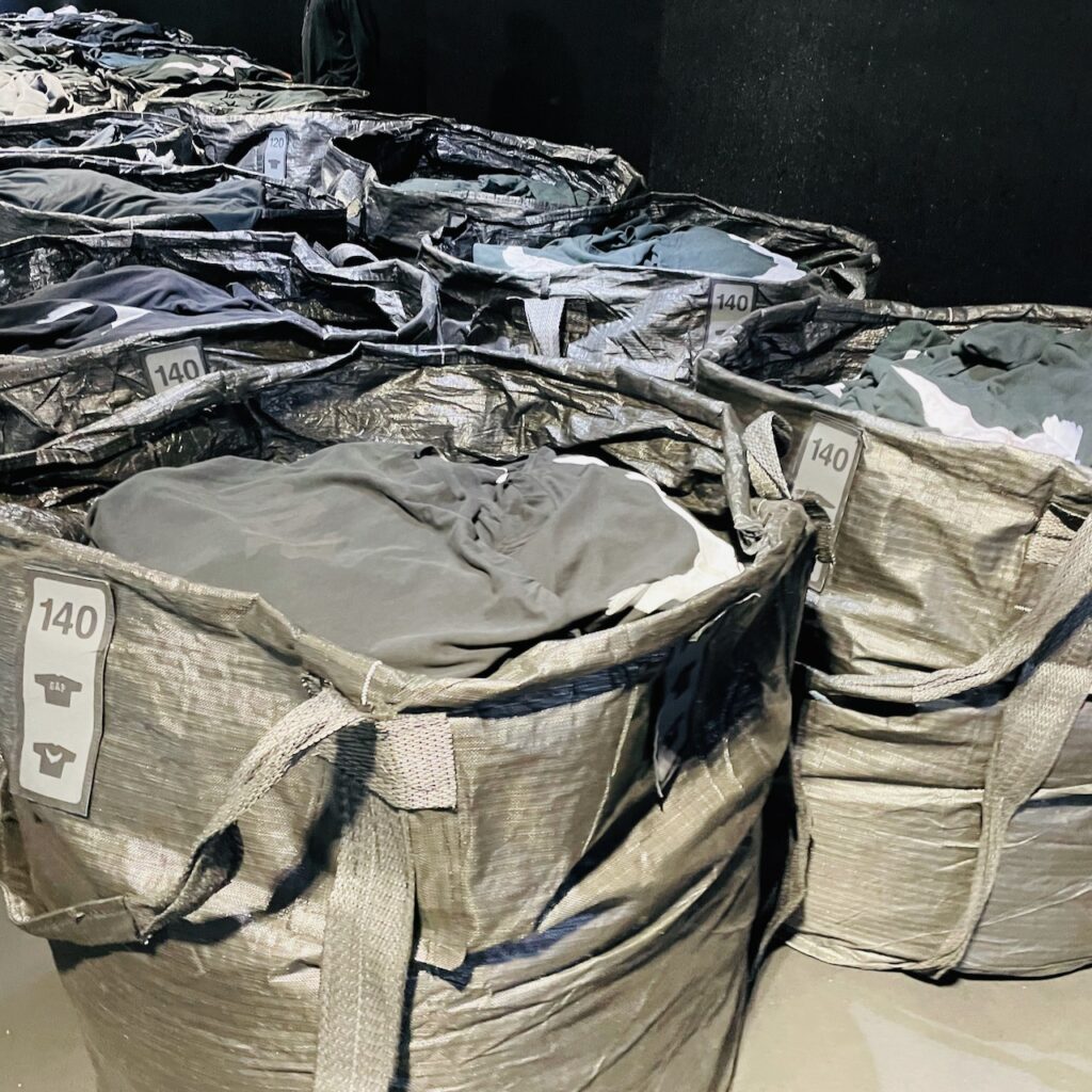
The idea, as I understand it, to to release a range of clothes through a retail experience that draws ‘inspiration’ from homelessness, hence the way the products are displayed in-store.

I have seen plenty of homelessness in Australia, the US and elsewhere. This did not feel connected. certainly, US$350.00 for a basic hoodie did not feel homelessness connected.

Hey, kudos to them for trying a very different approach. At the Times Square store, the whole ground floor was given over to the experience. You had to go down the escalator to the lower level for the traditional GAP experience.

For me, I think storytelling, the connection, that Kanye West claimed to be aiming for was missing. It felt like controversy created for the sake of it, to get in the news, which it has.

The whole experience did not feel like innovative or even experiential retail. To me, it felt gimmicky, attention seeking for the sake of it, without the social purpose claimed in interviews.

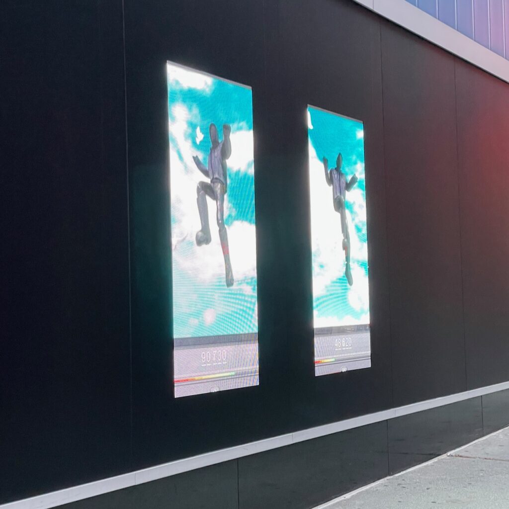
Here are some photos I took of what I saw. The first photo is the signs outside the business while the next three are the ‘visual merchandising’ inside.


Kanye West says this is his art and while art appreciation is subjective this does not read like art to me. The price tag for one says that – it distances the ‘art’ from the claimed intent.

But, this is a retail location designed to sell stuff, in a high-traffic location known for selling stuff. This collaboration felt off, odd … but I am glad I got to see it.

Now, for more background on this range and the story behind it, this article by Jake Silbert and published yesterday at Highsnobiety is a worthwhile read from someone more aware of Kanye, trends and the US experience.

11 likes
retail

Stunning Father’s Day display

This Father’s Day display at newsXpress Sarina is stunning. Shelley and Mark run an innovative business, which is continuously evolving. What they achieve in their town, which is 30 minutes from Mackay in Queensland, is best-practice.

Their success, like this display, is their own innovation. I share it here for inspiration.

16 likes
Newsagency management

The cozy appeal of the newsagency

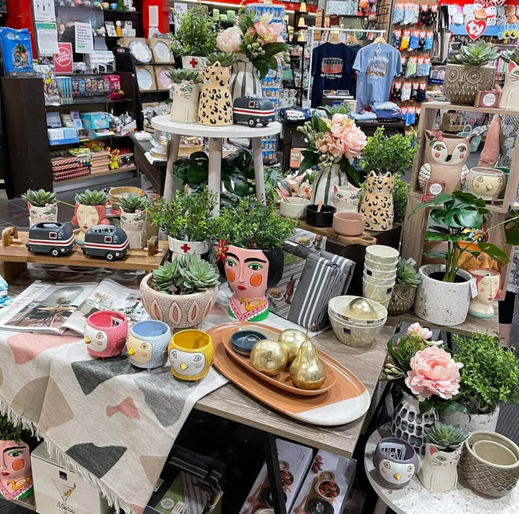
We have pitched this cozy look at the front of one of our shops over the last week, as part of our approach casting the business outside off what is usual for a newsagency.

The response has been wonderful with new customers visiting, and purchasing. The comments have been terrific.

All the items in the display are full suggested retail even though a third of the products were purchased at half off wholesale. The GP% being achieved form this table is above 60%, which plays against what is traditional in a newsagency.

Vicual merchandising is storytelling and the creative person who put this display together is sure a brilliant storyteller. I am so grateful to have people in the businesses who can do this.

7 likes
newsagency marketing

Owning your retail space

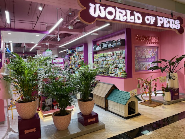
I am just back from attending The Retail Summit in Dubai. It’s good getting out and looking at other retail again, after 2 years. One thing corporate retail does well is owning the retail space, with a whole of story visual. Here in indie retail world we do not do it well: there are too many messages, too much noise that is not connected, too many distractions.

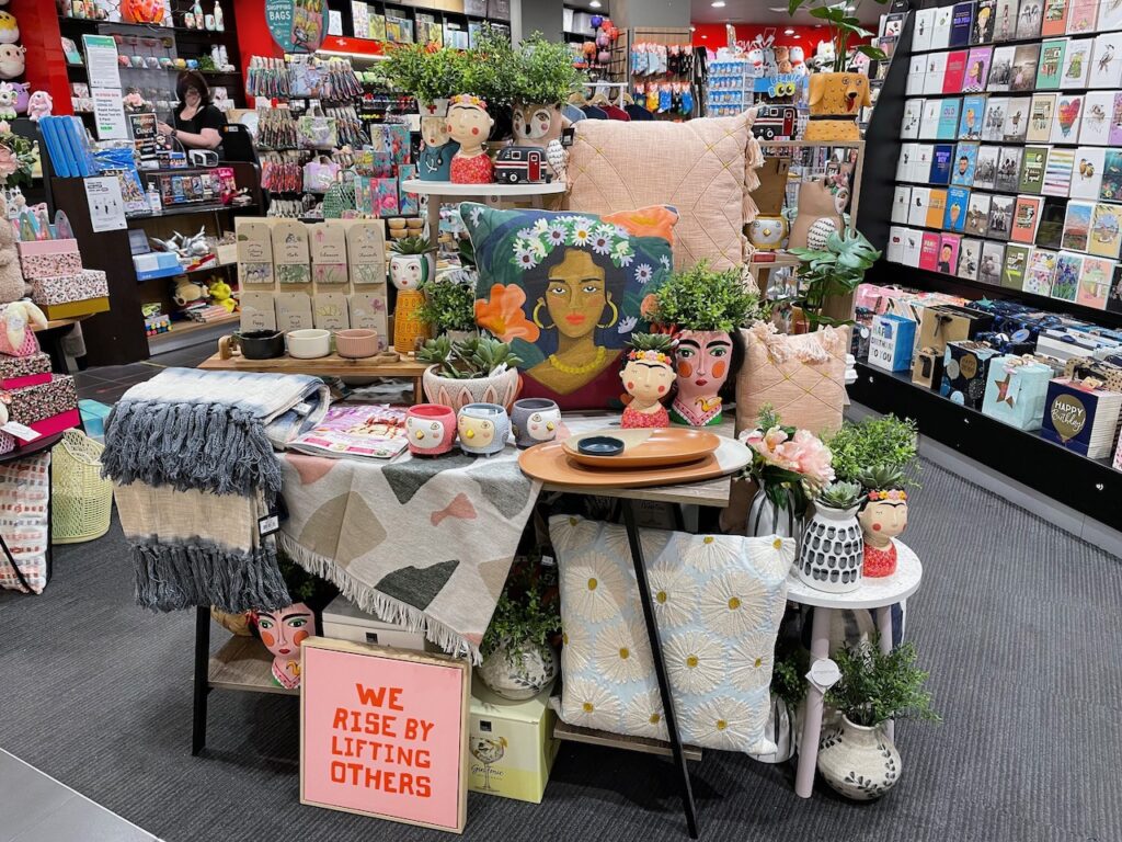
This first one did feel a bit much, but … it was noticeable.

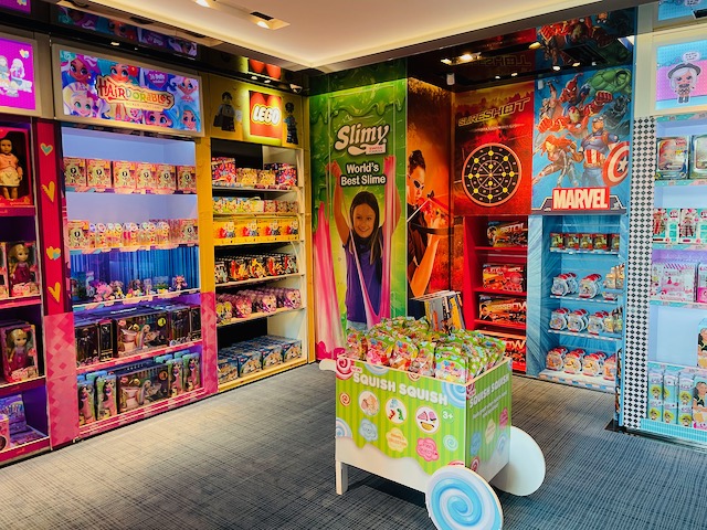
This one is a toy shop with all wall space dedicated to brands they sell – I suspect funded by the brands. but, nevertheless, effective.

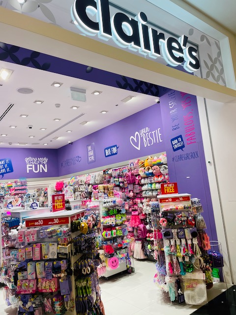
Claire’s is an international chain. Their look has been like this for several years. Their corporate imagery frames the products they sell. Very cohesive.

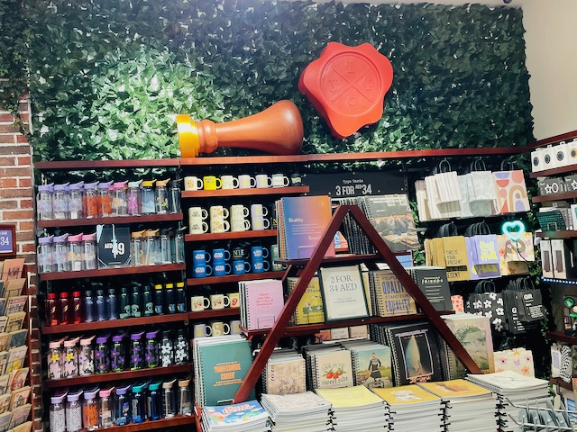
Now, this last one is a bit different. It’s Typo, the Australian company. While there is a cohesive visual throughout the store, each wall is different. I included this photo to show how they use green life texture to make the shop more appealing.

We have done this is 2 of our shops. Not on the scale of Typo, but it does look good. In a newsagency business it works especially well behind the counter.

4 likes
retail

The window of the shop

For habit based shoppers, what you put in your front window will not be noticed by them, as they are more often than not destination shopping when them come to your shop.

This is why I suggest to retailers that they not pitch destination products in the front window or on the lease line. It doesn’t;t make sense to me to show off what you are known for.

I like to use a front window or a lease line display to pitch what I am not known for, to get people to notice or turn their head at least, and, maybe come in to check us out.

The more we can play against shopper expectations the better I think for the expectations attached to newsagency shops are rooted in history.

This display is from one of my shops from yesterday. It speaks to this desire to pitch what we are not known by most for. It speaks to a freshness and a warmth if you will outside of what may be associated with shopper assumptions re a newsagency.

The mix of colours, textures, product categories and gifting occasions pitches a diversity that we think will help us attract people who might otherwise have passed the shop by. We are really happy with the mix. Quite proud actually.

This approach to outside traditional newsagency category pitching at the front of the business is easier for us given that we don’t have lottery products. While we are asked daily (ugh!) by people who tend to not look around themselves, we are getting more people asking about gifts they’d like to give.

This display at the front of the shop will remain in this form for no more than two weeks. Then, it will start to evolve. depending on new sales and new inventory availability it may be completely replaced at that time.

Let me leave you with some sales benchmark guidance. Plenty of newsagents are doing gift revenue of two and three times their card revenue, some even more. Those doing less than their card revenue have excellent opportunity for growth and that is the key point I’d make as there are many Newsagency businesses with that opportunity on the table.

Oh, and one final point. To show what I mean by being on the lease line, look at this image as through it you can see the Coles supermarket that is opposite us.

10 likes
Management tip

Leveraging the Better Homes and Gardens opportunity

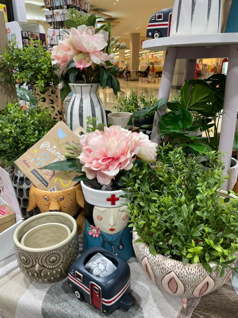
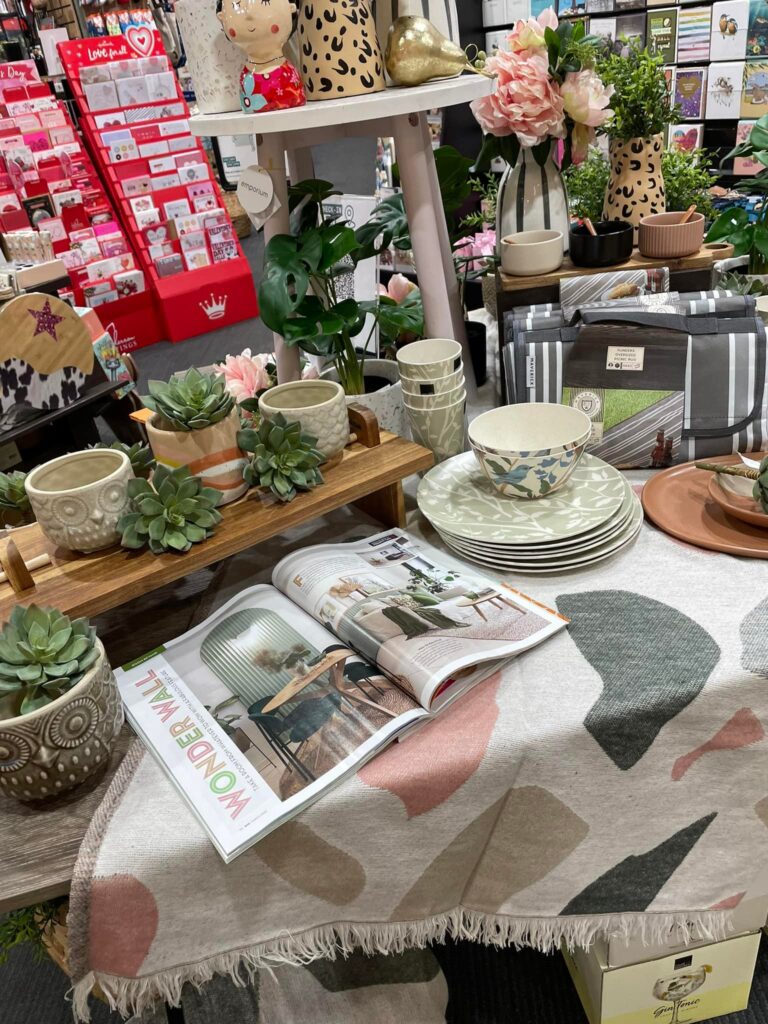
It’s terrific when there is a feature in a magazine of products you have in-store. This is the case with the latest Better Homes and Gardens magazine.

We have the magazine open and placed with the products it showcases, products we usually carry.

What a treat!

And, yes, this is a display in a newsagency. It is placed at thew front of the store so passers-by can see it and, hopefully, enter as a result.

Homewares is one of the best performing categories in newsagencies right now, delivering good year on year growth, good stock turns and good margins. Plus we have access plenty of suppliers in this space.

Footnote: while the publisher may want a display that’s all about their magazine, this display we have created does more for magazine and homewares sales, and that is what matters to us as the retailer.

8 likes
Newsagency opportunities

Inviting shoppers to the newsagency

Here’s the front of one of my shops. The photo is from yesterday. It is deliberately open with products selected and placed to play against assumptions about newsagencies.

It’s working a treat.

Every day we make decisions in our shops about how we want our customers to see us, what they should expect from us. We do this through our product ranging, shop floor placement and social media pitches.

If we act traditionally, what we see through our register will be traditional. And, traditional is where plenty of newsagents are comfortable, which I respect. It’s not for me … hence the pitch you see in the photo.

Despite what we may think, we do have control over our businesses, what we carry, where it is displayed, how it is displayed, how it is priced and how we speak to it in-store. These are decisions we get to make, decisions that determine how shoppers see and interact with our businesses.

While we are part of a channel, the shops in the channel have become so diversified that there is no one model, no consistent pitch, except in an area under contractual control such as lotteries for those with that.

Now, on the displays … the tables you can see continuously evolve. There are major changes every two weeks and less major changes every few days. Oh, and in terms of the tables, we have eight positions like the in the photo inside the shop, each providing their own storytelling opportunity.

This space is called the dance floor, because of the never ending dance of movement of inventory and display fixtures.

I am grateful to the team members who have brought this latest offer alive. They have done a wonderful job.

11 likes
Newsagency management

Clever visual merchandising engages shoppers

This display is working a treat in the newsagency. Terrific comments and, better still, sales.

When it comes to VM, every day for us it is about playing against expectations and assumptions, trying, through product range, placement and display to pitch a narrative that is fresh and relevant to now rather than a reinforcement of a past.
6 likes
visual merchandising

The mid-store VM pitch in the newsagency

While there is no doubt that the front of any shop is key, the middle of the shop is equally important, but often neglected.

It’s in the middle of the shop where you get to speak to shoppers, people looking for something, people wanting to be sold to. People who spend Tim in the middle of the shop are less likely to be convenience shoppers or destination shoppers – depending on what is located where in your business.

We use the middle of the shop to tell stories of categories and ranges of which we are proud. Take our latest baby / young kid pitch.

This beautiful display, not done by me, is a stunning representation for the category. It is placed with cards for the same occasions nearby. It is also placed so as to not hit magazines from being seen from outside the business.

It’s a display unlike what a newsagency in Australia is known for, like many of our shop floor displays.

Shopper reaction has been wonderful through words and purchases, both are important, of course.

This mid-shop space has the same lease cost. make it work.
Key to success is that you do not have purpose made shop fixtures. Simple fixtures you can mode and adjust are key here. This allows you to crate for the requirements you have right now.

My message today is – look at that mid-shop space you have, think about how you can use it to benefit the narrative of your business. Don’t let it be wasted space, space in which you are not invested.

Retail newsagency management today is about innovation, with a budget, chasing a commercial outcome, in supporting of the narrative you want for your shop.

7 likes
Newsagency management

Bright Easter for front of store

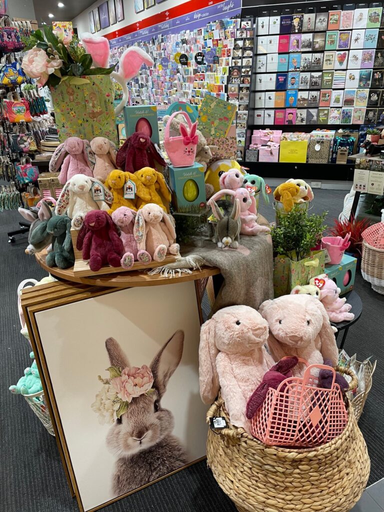
We have had our easter pitch up and at front of store for 10 days and it has been working a treat, drawing shoppers to the business from the busy car park to main centre mall thoroughfare in which we are situated.

It’s the plush items that are attracting shoppers. We watch them drawn to the shop, picking up items, and being drawn further inside looking at other items.

The display is a key pathway to purchase:

  1. Notice the display while walking past.
  2. Walking toward the display.
  3. Picking up and item or 2.
  4. Looking beyond the display and into the shop.

We see this pathway work regularly. We actively watch as this engagement is key guidance as to whether a display is working or not.

Easter is a terrific season beyond the significance for those with with Christian beliefs. It is a family tradition season for many and that is where it works well for us.

I didn’t create the display in the photo. I saw it for the first time a week ago when visiting the shop. It is terrific. I am grateful to those who put this together.

7 likes
Newsagency opportunities

A more relaxed approach to magazine retailing

I am grateful for the opportunity to visit Bass Pro Shops Outdoor World in Las Vegas recently. This massive fishing, hunting, outdoor, firearms and country living business delves into related categories, including home furnishings, magazines and cards. Here is a video showing their in-store pitch for the three categories. It a relaxed approach to magazine retailing especially. For context, I’d note the cost per square metre of this space for them is barely a fraction of the cost to the average Australian retail newsagency business.

9 likes
magazines

Leveraging behind the counter in the newsagency

We like to keep behind the counter clean and simple, to use it as a billboard for a promotion or seasonal theme. All through October we have done this, pitching the October is Beanie Boo Month newsXpress promotion, which has been on TV nationally.

As the photo shows, the display is balanced, product driven and with a clear message at the heart. We have found this works – keeping it simple with a singular focus.

Shoppers ask about the product and purchase from what is on display. We notice people looking at the display as they wait to be served or are being served. This is why simple is best, we don’t have much time in this situation.

This behind the counter wall is best used for easily understood and purchased items, items people will happily add to their basket at the last minute.

I think it is best to have only one product or one category represented in the behind the counter display. Mixing it up with multiple product categories can be confusing and leave shoppers not noticing your pitch.

The critical thing is that your behind the counter space works commercially for you. If it is not, change it until you find a mix and display approach that works. And once you find that, try and copy it, learning each time.

Having a behind the counter focus is another small step strategy that can add value to the business. While you won’t retire on the proceeds, it is a piece in the puzzle of growth.

10 likes
Newsagency management

Promoting the joyfulness of sending Christmas cards

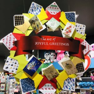
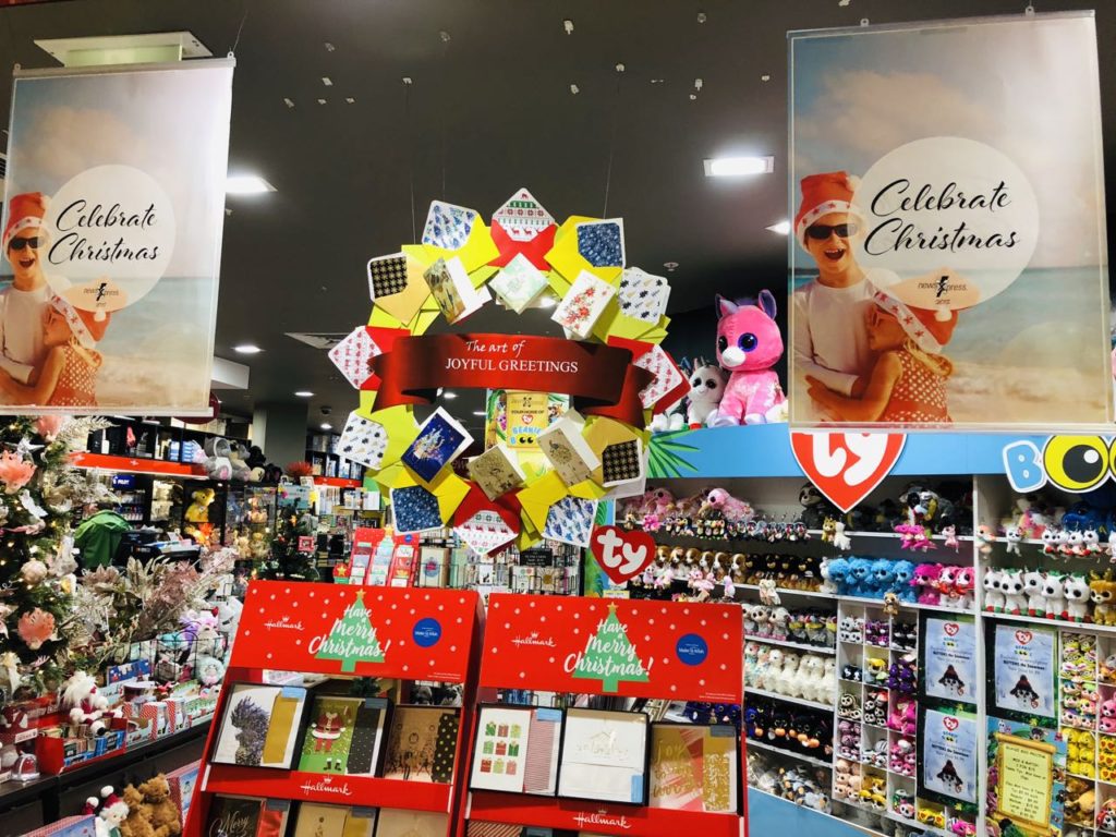
This handmade in the shop wreath featuring Christmas cards is getting comments from shoppers. It is also attracting people to the shop to see it and the products it is helping to promote.

It is bright, unique and celebratory. It is unlike any other card or Christmas-themed collateral in Australia right now.

The wreath sits as a centrepiece, above some of our boxed cards.

Being double sided, the wreath pitches to shoppers outside the business as well as those inside.

What I like about the wreath is that it pitches joyful greetings. I think that is a terrific Christmas pitch without being over the top.

I also like that it was made in the shop and features cards we have available for purchase.

You know you have a winner when a competitor comes and takes close up photos.

I first saw a wreath like this in the US a week ago in several outlets of a card and gift chain that has no connection with Australia. That one was one sided and did not contain some of the elements of this wreath. So, leveraging the US idea, we added our own touches and created something that pops beautifully, something that is unique in Australia.

A how-to guide was created for newsXpress members to create the wreath locally. This includes step by step photos and advice on the physical assembly as well as advice on how to make the card envelopes visually pop.

Looking at boxed and single Christmas card sales for October, we are ahead of  this time last year, which was ahead of the year before. We are thrilled with the double-digit growth.

All card retailers need to engage with the category beyond keeping pockets full. We need to encourage people to buy and send cards, we need to remind people of the emotional connection as well as of the value of the memories when cards are looked at down the track.

Australians by less than half the cards per capita than people in the UK do and around 25% less than people in the US do. We, along with suppliers, need to grow engagement, we need new card shoppers and we need card shoppers spending more.

I think one way to do this is to appeal to the emotion of the giving. There is no downside for retailers in pursuing this.

This wreath is a small part of a much bigger strategy that focusses on growing card sales by converting people to card buyers and providing them an in-store experience that guides a deeper basked purchase from the category.

14 likes
Greeting Cards

A fresh approach to displaying diaries

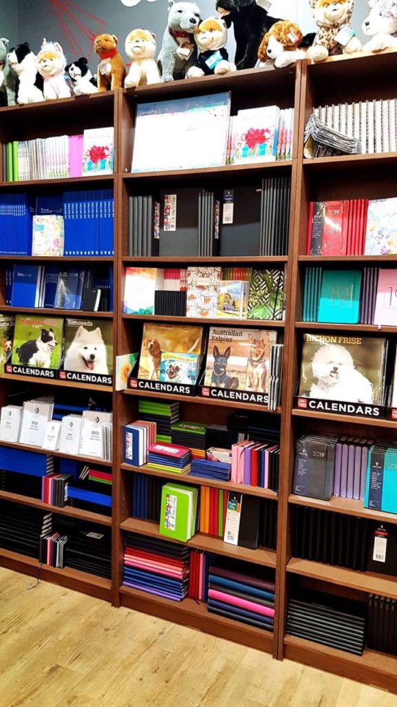
We have changed our approach to displaying diaries, using bookshelves…

The reactions have been terrific in terms of comments and purchases.

We like the bookshelf placement as it addresses the floorspace challenge that is often the case with diaries as they are heavy and hard to shift around.

I like the layered use of the bookshelves, too, for calendars and plush, all themed.

We have to change how we display products people expect in our businesses, otherwise shoppers will assume we are like every other retailer with these same products.

14 likes
Stationery

Visual merchandising inspiration

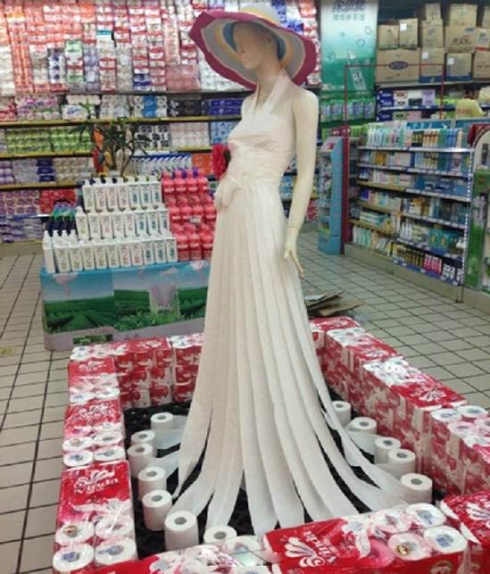
I am grateful to a colleague for sharing this terrific display of toilet paper.

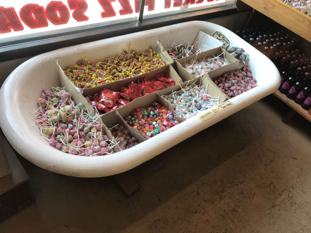
I love the use of a bathtub in a candy store I saw last week:

You really can use anything to display stock.

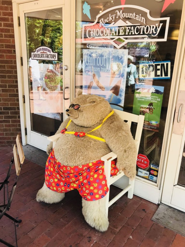
I love this fun placement out the front of a different candy store that I saw last week:

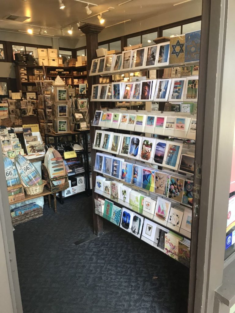
I love this placement of cards at the shop entrance, such that you can see it from out the front of the shop.

This tactical placement cold attract card shoppers who might otherwise has passed buy the shop.

6 likes
Greeting Cards

Placement is key to seasonal success in the newsagency

Where you pitch a major season like Mother’s Day is key to success you achieve from the season. To me, the best placement is that which can be seen by people walking past your business. That is, just inside the door, or out the front of the shop if permitted and possible.

If you can achieve the right location, the next key action is to change the display weekly, so that it is noticed by those who walk past daily.

Hiding a major season display in the store so that everyone walking past cannot see it is a lost opportunity, as is leaving the display unchanged for most of the season.

Going out four weeks out from a major season gives you a better opportunity to be remembered as the go to store when the shopper is ready to make the seasonal purchase. This is why I say be in the best front of store location and why you change the display weekly.

Even in this marketplace of extraordinary competition for seasonal card and gift sales, we can grow if we actively engage on the shop floor, through our buying and outside the business through innovative online marketing.

Sure, it is hard work with actions required every day. The reward is traffic and revenue growth for a season that the majority of shoppers will engage with at some point.

7 likes
marketing tip