A blog on issues affecting Australia's newsagents, media and small business generally. More ...

Tactical display

Full face Easter card pitch is working well
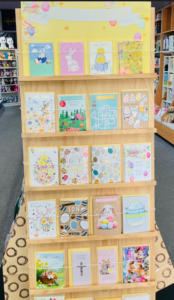
We launched Easter with in our high street business a month ago with this full-face pitch. It’s worked a treat, delivering strong sales.

Shoppers like to see the full front of each card. This has led to less touching, less stock damage. It has helped maintain an organised display.

The placement, just inside the front door, is encouraging engagement from some who many not have purchased an easter card or who may have purchased later in the season, and elsewhere.

While I don’t have proof, my feeling is that the tactical placement of this full face display is a key factor in Easter success already. We’re ahead on 2020, of course, and 2019, which was the goal … and we ten days out.
3 likes
Greeting Cards

Leveraging behind the counter in the newsagency

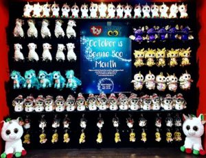
We like to keep behind the counter clean and simple, to use it as a billboard for a promotion or seasonal theme. All through October we have done this, pitching the October is Beanie Boo Month newsXpress promotion, which has been on TV nationally.

As the photo shows, the display is balanced, product driven and with a clear message at the heart. We have found this works – keeping it simple with a singular focus.

Shoppers ask about the product and purchase from what is on display. We notice people looking at the display as they wait to be served or are being served. This is why simple is best, we don’t have much time in this situation.

This behind the counter wall is best used for easily understood and purchased items, items people will happily add to their basket at the last minute.

I think it is best to have only one product or one category represented in the behind the counter display. Mixing it up with multiple product categories can be confusing and leave shoppers not noticing your pitch.

The critical thing is that your behind the counter space works commercially for you. If it is not, change it until you find a mix and display approach that works. And once you find that, try and copy it, learning each time.

Having a behind the counter focus is another small step strategy that can add value to the business. While you won’t retire on the proceeds, it is a piece in the puzzle of growth.

10 likes
Newsagency management

Pitch Better Home & Gardens with papers

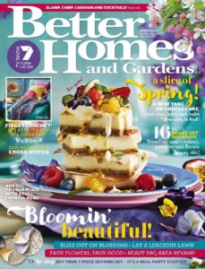
I have written this here many times in the past but it is worth repeating. If you place some stock of Better Homes & Gardens next to your top selling newspaper sales will increase, you will achieve impulse purchases.

This placement costs nothing extra in terms of inventory, k time and space. It is an easy win for the business. It is good customer service.

6 likes
magazines

Visual merchandising inspiration

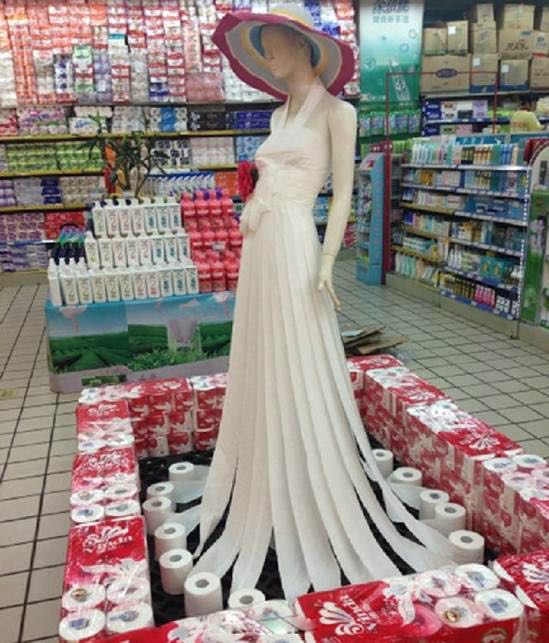
I am grateful to a colleague for sharing this terrific display of toilet paper.

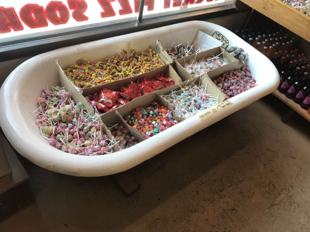
I love the use of a bathtub in a candy store I saw last week:

You really can use anything to display stock.

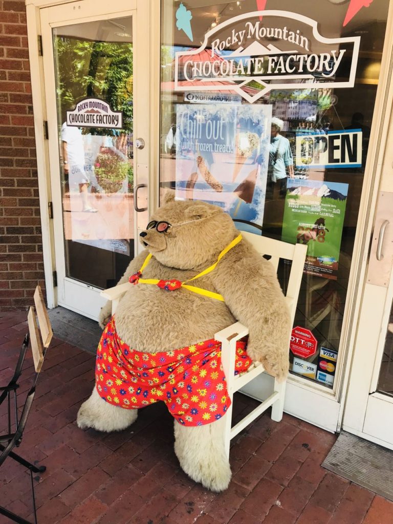
I love this fun placement out the front of a different candy store that I saw last week:

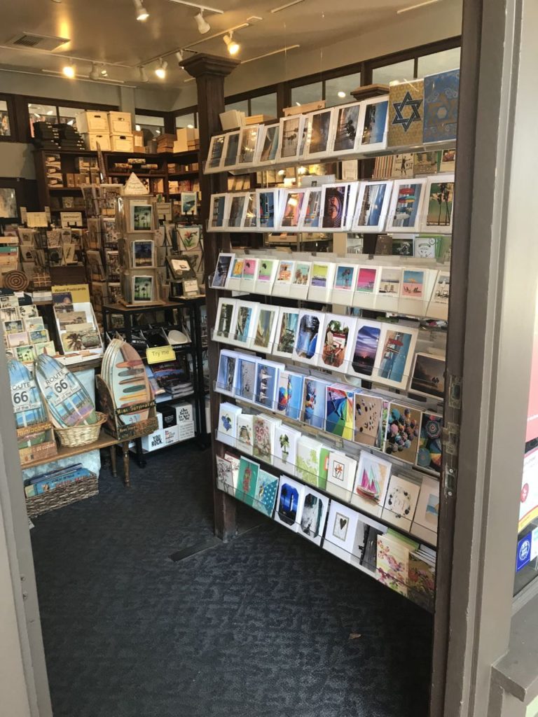
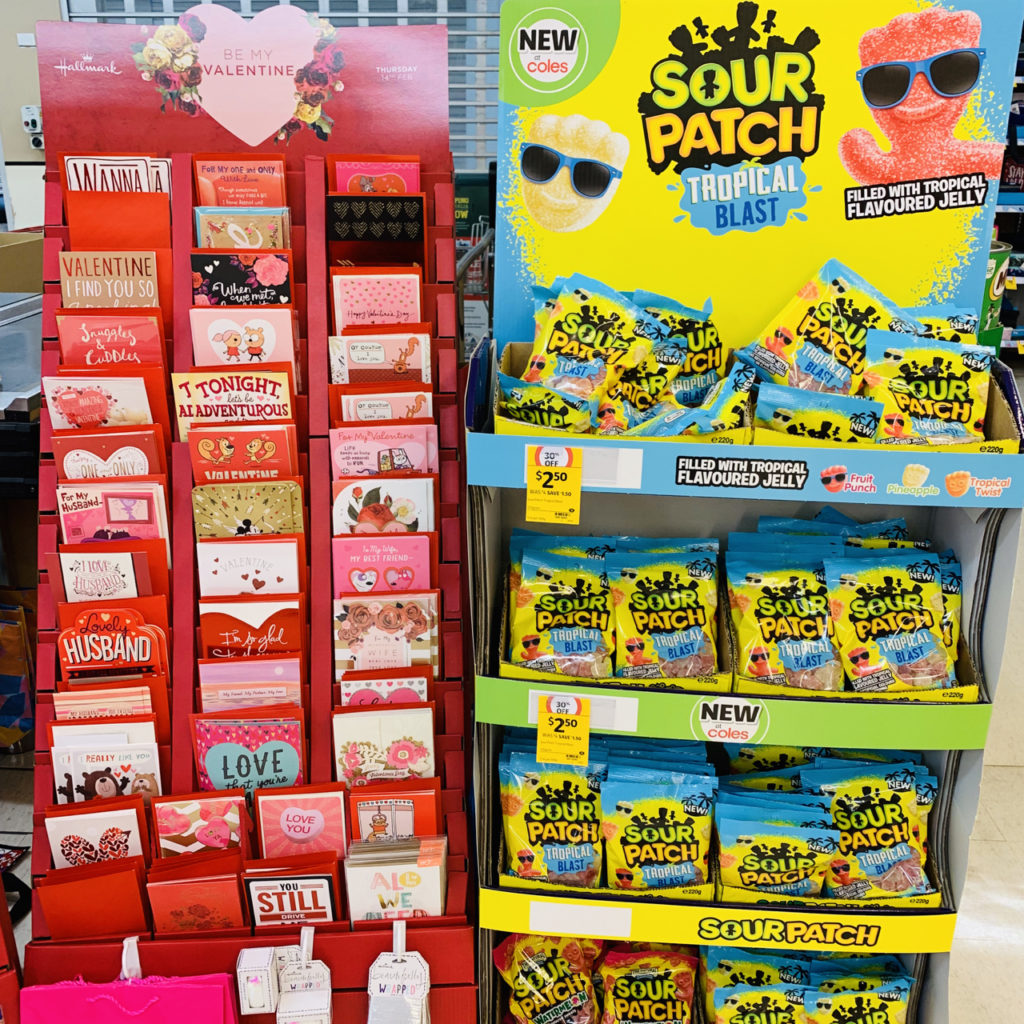
I love this placement of cards at the shop entrance, such that you can see it from out the front of the shop.

This tactical placement cold attract card shoppers who might otherwise has passed buy the shop.

6 likes
Greeting Cards

Another opportunity to engage in the marriage equality conversation

I am looking forward to reading the Quarterly Essay by Benjamin Law that is to be published in ten days. While I have not read the essay, I am aware of Benjamin Law’s work and respect his thoughtfulness and contribution on many topics of societal interest. His essay, Moral panic 101 Equality, Acceptance and the Safe Schools Scandal, is bound to be controversial, entertaining and provocative. These are all good attributes of any contribution to the timely conversation Australia is having right now.

We can decide how important the topic is in our own businesses with our decision as to where the title is placed. I suspect placement with newspapers would be ideal. It is more likely to be considered for purchase there than, for example, at the counter.

The alternative is to early return or hide the title. That would be sad for a few reasons: this is an Australian publication, it is certain to get media coverage and sales revenue should be a motivator, it contributes to a local conversation, supermarkets won’t have the title. You can use this title to differentiate your business in a small way.

Regardless of your position on the $122M survey later this month, this issue of Quarterly Essay is worth supporting. Remember, we are retailers not censors.

Footnote: this post is not about which way to vote or about the same sex marriage survey that may be conducted later this month, depending on the High Court, it is about placement of a title to maximise the opportunity for the business.

16 likes
magazines

How newspapers are promoted in-store in the UK

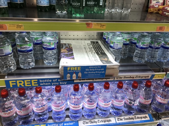
At a WH Smith store in a transit location in the UK earlier today I noticed this small stack of The Daily Telegraph newspaper placed in the fridge next to the water. While the water is the free item when you purchase the newspaper, the placement and design of the signage made me think the paper was free with water purchase. Maybe that is deliberate as travellers might be more likely to purchase water than a newspaper.

IMG_1356

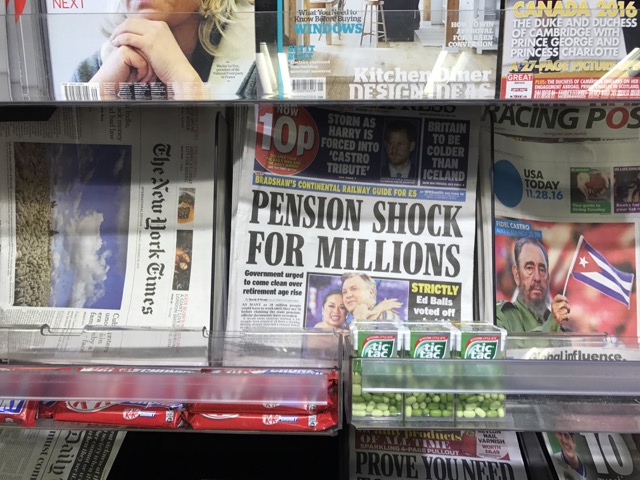
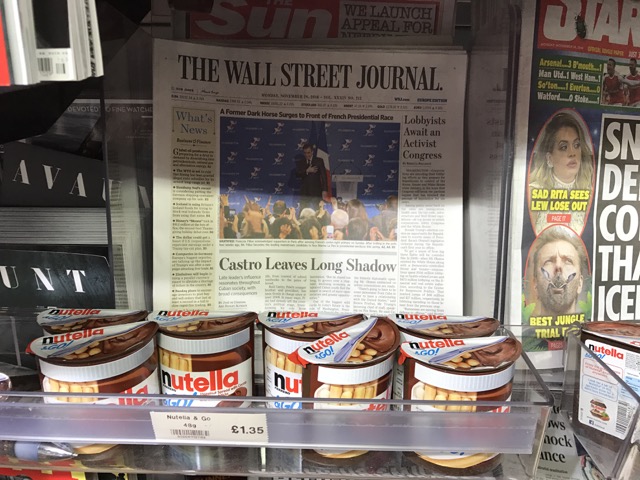
On the back wall of the shop I found the newspaper section. I like the placement of candy in front of newspapers. This tactical placement makes sense for driving a deeper basket. While the fixture is old and partially blocks the view of the paper, the move is smart.

IMG_1357

I am curious about the choice of product placement with newspapers. The Wall Street Journal and Nutella – who’d have thought?

IMG_1358 

I wonder how many newsagents in Australia actively place non circulation items with newspapers to drive a deeper basket? Small moves like these matter. If you look at supermarkets, they do the tactical placement for a deeper shopping basket well.

7 likes
Newspapers

The easy magazine promotion in the newsagency

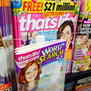
IMG_7506The most valuable magazine promotions are tactical promotions – deliberate placement of a title to drive impulse purchase. A successful tactical placement for us continues to be the placement of a pocket of That’s Life Word Search in front of That’s Life. We count how many we place in the pocket so we can be sure of the results.

A move like this takes a couple of minutes and, for us, it delivers an extra three to six copies purchased in a week. That is more valuable than some old school billboard-like magazine displays.

7 likes
magazines

Storytelling is magazine placement

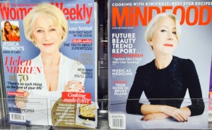
IMG_7233The decisions we make in placing magazines on our retail shelves represent a kind of storytelling. Look at the current issues of The Australian Women’s Weekly and Mindfood next to each other.

Each features Helen Mirren on the cover, and for similar reasons related to age. Whereas an average retailer will put the titles in their usual spot, most likely separately. A smart retailer places them next to each other, telling more of a story and, hopefully, driving sales.

4 likes
magazines

Aussie Christmas decorations popular

IMG_1889The Australian themed Christmas decorations we sourced from Gibson are popular among the early Christmas shoppers. We have had people purchasing these to send to family and friends overseas. To make the most of the opportunity we have them placed together in an Aussie Christmas section. They will sell out for sure.

4 likes
marketing

Garden magazines respond to co-location in the newsagency

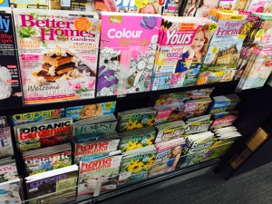
IMG_9735For the last two weeks have been pitching garden magazines in a second location underneath British and women’s general magazines, next to a couple of extra columns of crossword titles. This co-location is designed to get people noticing the titles who otherwise would miss them as they are in another aisle. As you might expect, sales are up.

While space is limited, we do like to move magazines around like this and co-locate small selections when time appropriate. With Spring here, garden titles placed as we have done is sure to work, and it is.

While I appreciate the frustration that magazines do not generate the margin dollars today that we need for growing rent and labour costs, any increase from additional sales has to be good. This is why I recommend newsagents look for opportunities like I have outlined in this post.

Tactical placement of magazines usually generates a more incremental business than any other promotion I run in-store.

3 likes
magazines

Promoting Your Garden in the newsagency

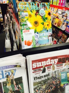
IMG_9377We have been promoting the latest Your Garden magazine with newspapers and shoppers are picking up the title on impulse.

I encourage newsagents to try this. We found space by placing it above papers. If papers are on a flat shelf, shuffle them for room next to your top seller.

Your Garden is quarterly and people forget about – hence the importance of driving impulse purchases.

1 likes
magazines

Secondary location driving adult colouring sales in the newsagency

IMG_9402While the display of adult colouring art therapy titles at the front of the shop attract shoppers from the busy mall, this second location half-way into the shop and near the card department is driving excellent sales.

The table in the photo is placed in front of the main magazine aisle. It has been placed to confront destination traffic as well as to push people either side to ‘notice’ other products we have in-store.

Adjacencies are everything in retail. Get them right and basket depth grows.

Time spent thinking about product adjacencies and destination traffic disruption can pay terrific dividends for us in our retail businesses. If you look at the photo you can see the cul-de-sac we have purposefully created for the shopper. It is working a treat.

Putting adult colouring titles in is okay. Do9ing so with thought to maximise the opportunity is vital given the competitive marketplace.

We make our own success and earn our own failure.

5 likes
retail

Coles shows their approach to cards off location

IMG_9175Check out the placement of Father’s Day cards off location at a Coles supermarket. This placement is deep inside the store, far away from the card department and the checkout. It is one of two placements of Father’s Day cards in this Coles. It reinforced to me the importance of interrupting shoppers to remind them of what they can purchase in a visit. This is especially important for Father’s Day as it is a season for which purchasing is too often left to the last minute.

Take a look at how you are pitching Father’s Day cards. Are they all in one place or in a couple of locations to make the most of the opportunity? Are you maximising the opportunity of all your traffic?

3 likes
Greeting Cards

Making a splash for Dolly

dolly5I found room yesterday to display all five covers of Dolly for the next week at least. The covers look terrific placed next to each other.

We’re fortunate to have fixtures that make eye level full cover display achievable in the magazine department.

4 likes
magazines

How to grow Diabetic Living sales

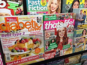
dbtlI’ve found the best way to grow Diabetic Living sales is to place it with health titles plus weeklies and or food titles. It’s a magazine often purchased on impulse – hence the importance of location. This week we have it with That’s Life as it always does well from there.

3 likes
magazines

Excellent branding and placement leverages traffic

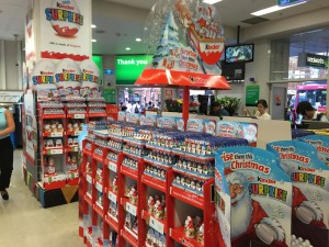
ksThis Kinder Surprise display at the front of the Woolworths supermarket on George Street in Sydney is terrific. There is no missing the Kinder Surprise branding as you enter of leave the store through the main entrance. Kinder Surprise owns the space. From the detail on the floor units to the large posters, this is a consistent and clear message.

While I expect there supplier would have paid for the space and had professional merchandisers create the display, the photo offers us inspiration for our local newsagencies, inspiration to give over key traffic space to a single brand that will interest our shoppers.

While many newsagents do excellent displays, they are often done on a small scale and end up fighting for attention in a visually busy shop. The approach in the photo shows the value of giving space reserved for multiple displays over to a single brand.

Click on the image for a larger version.

2 likes
retail

See, promoting at the counter works!

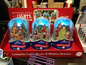
hmksnowLast Friday I wrote about the placement of this Hallmark Christmas snow globe at the counter and how lighting three globes up made it more noticeable. One customer purchased three, others purchased singles. Showing how a product works at the counter pays off.

Yes, we can grow sales in our newsagencies by being smart and engaged with our products!

4 likes
retail