Smart retailers embrace colour blocking
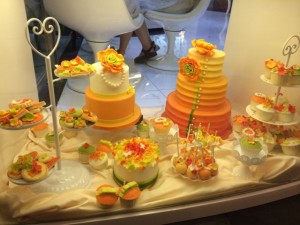 I’m posting this photo of an example of how a cake shop is using colour blocking to create a more visually effective display. We have many opportunities in our newsagencies to do this – to collect products together based on colour. The result should have a strong visual impact. It should also bring to the spotlight items that otherwise might not have had the opportunity.
I’ve added a new category of posts on the blog: colour blocking – to make it easier to see past posts about this.
Why colour blocking is important for newsagents and how to do it
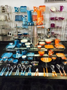 At the Christchurch Gift and Homeware Fair at the start of this week I saw another excellent example of effective colour blocking that is as relevant to a retail newsagent as it is at a Gift Fair trade display.
This gift / homewares supplier laid out their stand by colour, taking care to place colours next to each other that enhanced the impact – following a chart. The result was a series of stunning displays that many stopped and looked at.
Taking time with product placement and placing items which complement each other enhances impact. By compliment, I mean the two colours are on the opposed of the colour spectrum. This is why the orange and the blue in the photo work so well when placed next to each other – far more effectively than blue and green together or orange and yellow.
Colour blocking for impact and drive shopper engagement and this can attract new shoppers to your newsagency as well as getting existing shoppers engaging more with what you sell.
If you have lottery and newspaper customers who purchase nothing else, could it be that you are not doing anything stunning with your displays to drive their engagement?
If you don’t get lottery shoppers purchasing anything else stand at your lottery counter and follow with your eyes their exit from the business. What are you doing to grab their attention – tactically or visually through, for example, a colour blocking strategy.
What we achieve in our newsagency businesses comes back to us. The more actively and thoughtfully we engage the better the outcomes for us and for our customers.
It would be easy to dismiss this blog post as being about homewares and not relevant to us. Rather, it is completely about how we manage our newsagency businesses and the current-day professionalism we bring to the retail stories we tell through our displays.
Terrific colour blocking of stationery
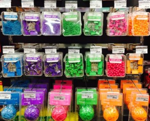 Check out the colour blocking of stationery that I saw at a newsagency-like Whitcoulls store in New Zealand earning this week. It looks good, very appealing. Their clever buying and in-store colour blocking helps them position paper clips, bulldog clips and rubber bands differently to what we see in the average Australian newsagency. This approach appeals to a broader audience.
Click on the image for a bigger picture.
Another example of colour blocking in visual merchandising
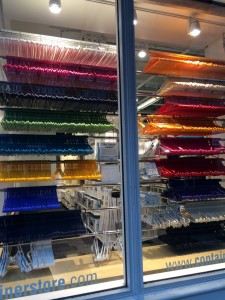 Further to my recent posts about colour blocking in retail, check of the photo of the window of a storage business in New York. They are showing there is no limit to what can be colour blocked. Coat hangers! Amazing.
I only noticed the window because of the colour blocking. The first goal of visual merchandising is to get a display noticed. The colour of the display makes hangars more appealing.
Sunday newsagency marketing tip: use colour blocking in your window to attract shoppers
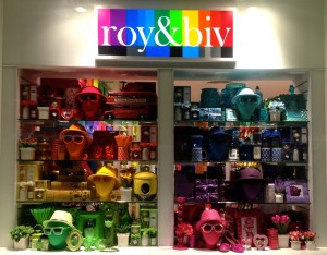 The front window of a retail newsagency is one of the most important marketing investments for the business.
A good window display will attract shoppers into the business and drive sales of the items prompted.
W good window display will surprise shoppers and challenge their expectation of what the business sells.
A window I saw last week stunningly used colour blocking to show off the range of products they sell. While colour is a key theme of this business, the window itself is inspirational for newsagents since we could try this given the colour of products we sell.
Colour blocking in a window display could see magazines, cards, gets, stationery and toys in the one display – getting shoppers to see items they did not know we sold.
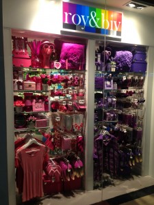 Here’s another window from the same shop in my example. Fewer colours – vertically blocked. These are ideas we can play with – not all the time but enough to get new traffic for our businesses.
A window display like this for a newsagency would see us challenge customer perception about us and what we sell.
A window like this is easy to create.
Allocate limited time to create the display and be sure to measure the results.
Happy Lab is an interesting model
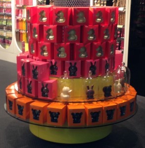 If you get a chance to see a Happy Lab store it’s worth it as it shows how colour blocking and creative packaging can get people spending more on an everyday item than they otherwise might. It’s Smiggle for candy and chocolate lovers. Take the easter chocolates in the photo. At Happy Lab the price is close to three items I’d pay for a similar item elsewhere. However, the packaging and display are stunning, making it easier for shoppers to spend the higher amount. This is the Smiggle model with what I consider to be overpriced stationery for kids. Make something fashionable and people want it without worrying as much about price.
Another point about Happy Lab – I love their name as it’s, well, happy. Happy sells as I mentioned a few months ago about coke.
