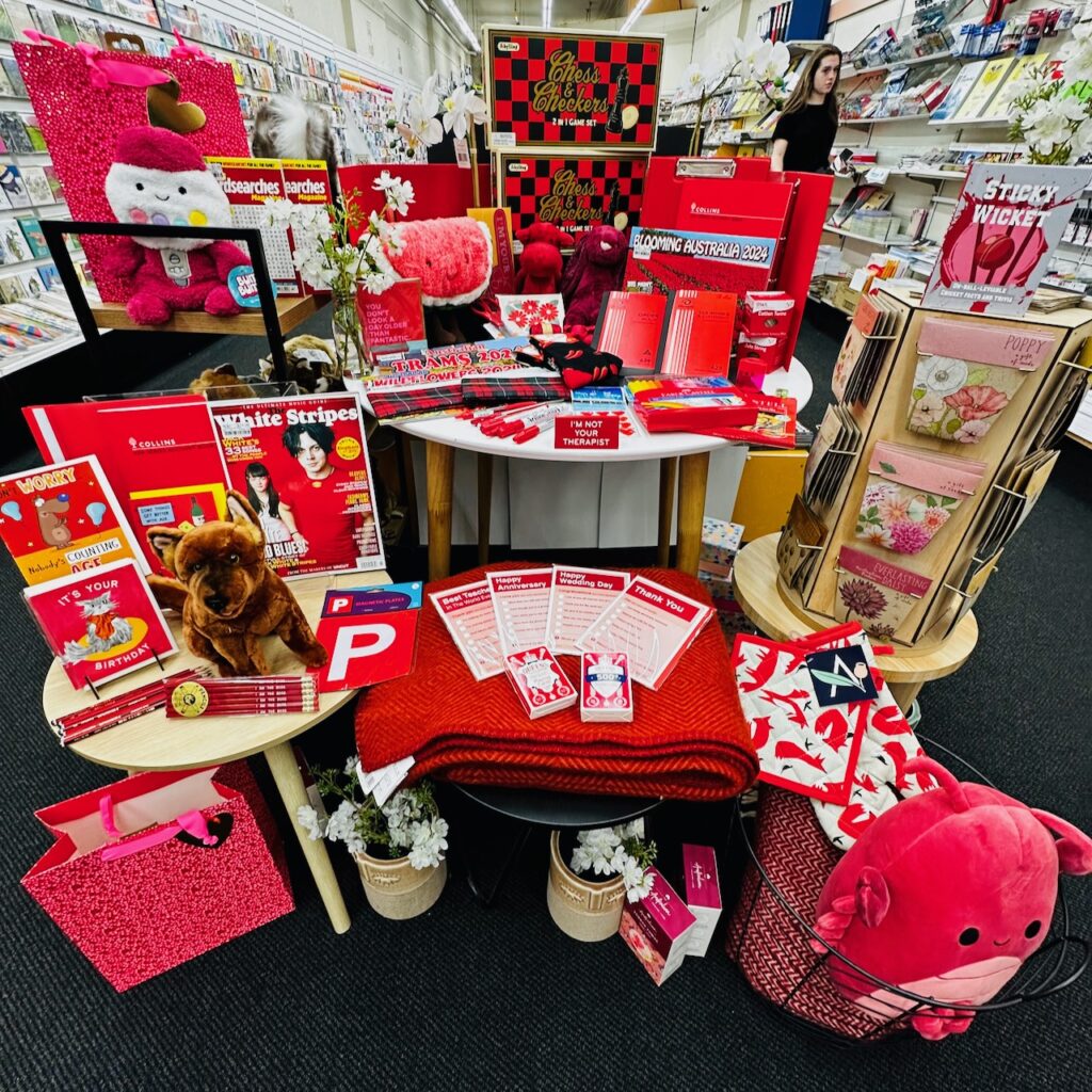
We have been grouping products by colour in one of my newsagency shops. The only rule is that every product in the display has to represent the colour of the week. This week, it’s pink:

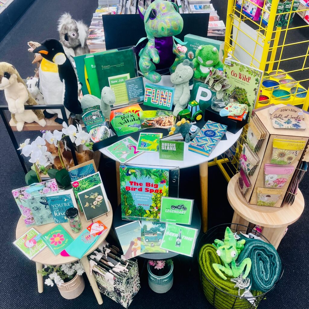
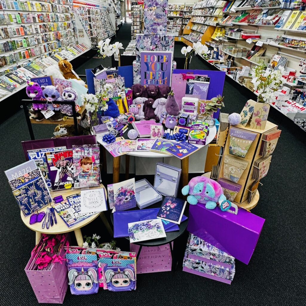
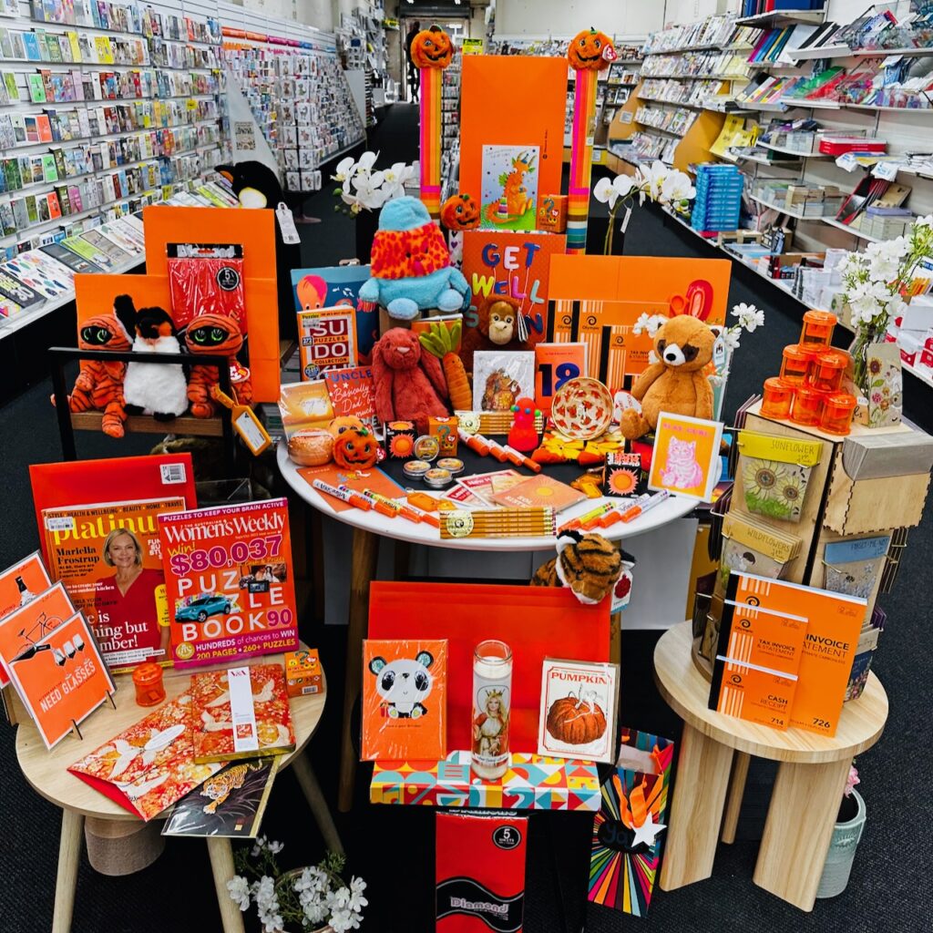
If you zoom in you can see the variety of products: manila folder, marker, plush, cards, gifts, soap, jewellery, sensory putty, luggage tag, gift bags, seeds, journals, books and candy. That’s a key point here – the diversity of products that are at home in a colour specific display like this.
We have the display situated so that everyone entering the shop through the front door sees it. You can also see it from out on the street.
This is the fourth week of this colour-wave pitch. We don’t purchase products for it. Everything is from shop floor stock.
Anyone can do this. And, because the colour is the feature, you don’t need to be a visual merchandising whiz to make it work. It takes around 10 minutes to choose products and create the display. This time note is important as it reflects our approach of not overthinking things.
We leave the display up for no longer than a week, which ties back to my advice to not overthink this.
The shopper reaction has been terrific.
Now, if you do try this – it may take a couple of weeks, a couple of colour blocked displays, for shoppers to engage, or even comment. This is not, initially, about sales. rather, it is about products being noticed, change being noticed, things in the shop other than the destination purchase being noticed.
In case you are wondering, here is our first one: yellow.
![]()
And, here is our second one: green.
Have a crack, it’s easy, and there is no inventory cost. There’s a bonus of the person doing it learning more about products in the shop.