I am just back from attending The Retail Summit in Dubai. It’s good getting out and looking at other retail again, after 2 years. One thing corporate retail does well is owning the retail space, with a whole of story visual. Here in indie retail world we do not do it well: there are too many messages, too much noise that is not connected, too many distractions.
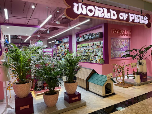
This first one did feel a bit much, but … it was noticeable.

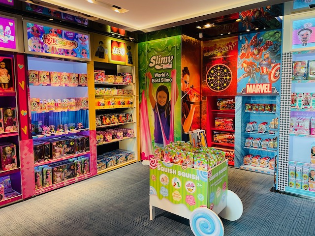
This one is a toy shop with all wall space dedicated to brands they sell – I suspect funded by the brands. but, nevertheless, effective.

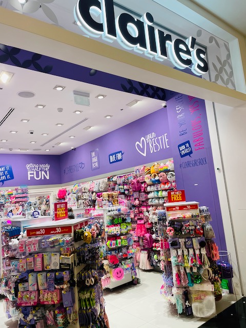
Claire’s is an international chain. Their look has been like this for several years. Their corporate imagery frames the products they sell. Very cohesive.

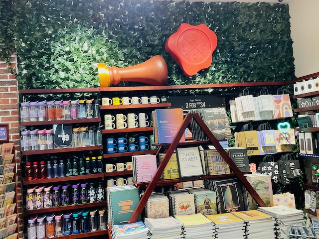
Now, this last one is a bit different. It’s Typo, the Australian company. While there is a cohesive visual throughout the store, each wall is different. I included this photo to show how they use green life texture to make the shop more appealing.

We have done this is 2 of our shops. Not on the scale of Typo, but it does look good. In a newsagency business it works especially well behind the counter.