That space as you head toward the counter is premium in any retail business. So, too, is the counter itself … but today I want to focus on the space close to the counter, as the customer approaches it.
Officeworks have been getting this space right for a while now, placing impulse lines there that are easy to pick up. It is their product adjacencies that are particularly smart.
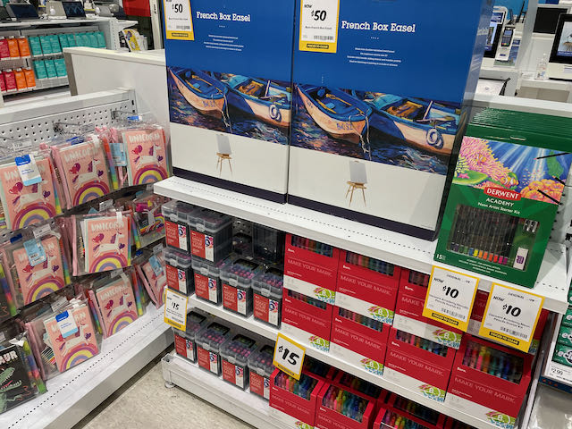
Take this example of art supplies. They have a bunch of items together that could see a parent or other relative pick up several items to make for a nice gift for a kid.
This photo shows items three or four steps from the counter. No need to shop the shop, move between different locations, all you need is there.
There were more items than I caught in this photo.
I like this mix of products as it shows what’s possible at or near the counter. For too long in our channel we focused on low price, convenience lines. While some in our channel are having success with more expensive items at the counter, most continue to play in a more traditional way in this space.
Taking a look in-store at an Officeworks store and their counter related pitch could be useful.
