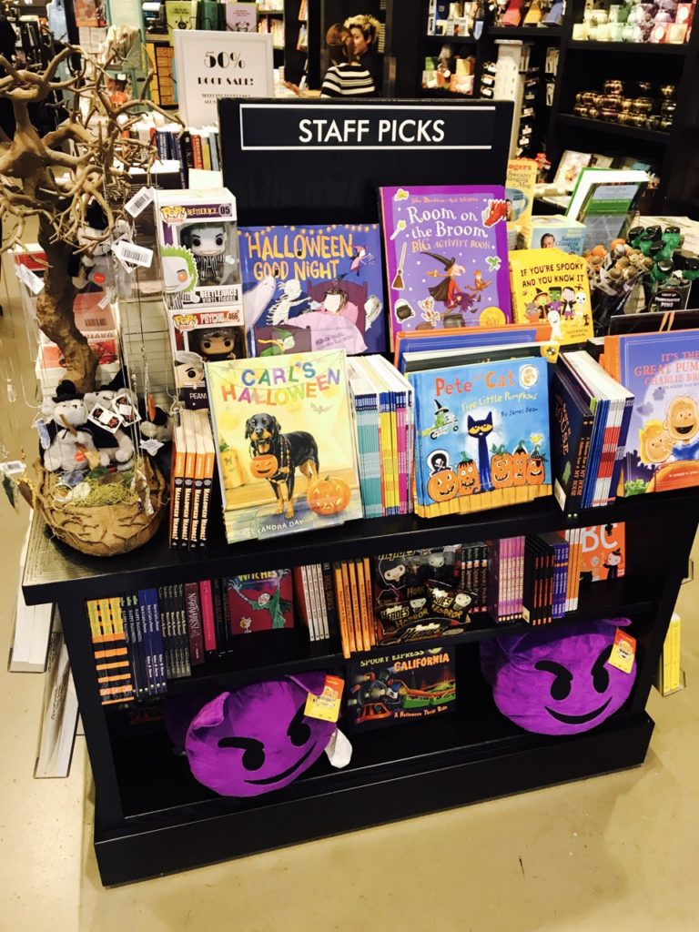
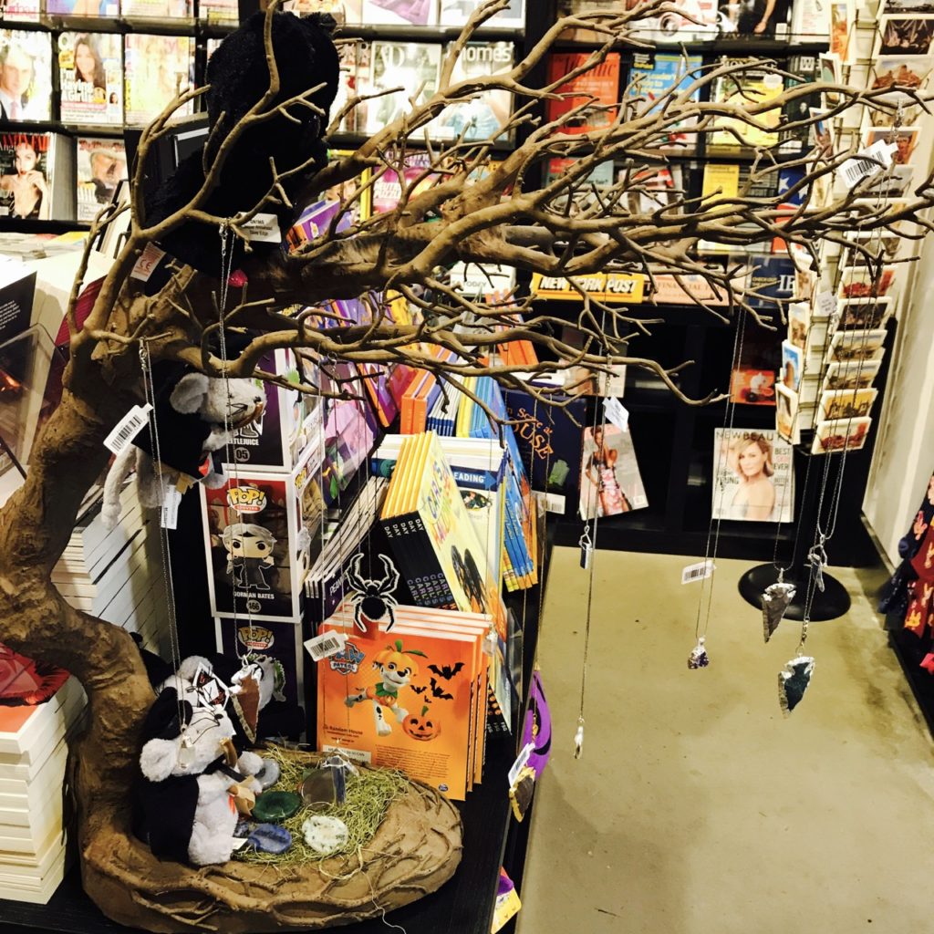
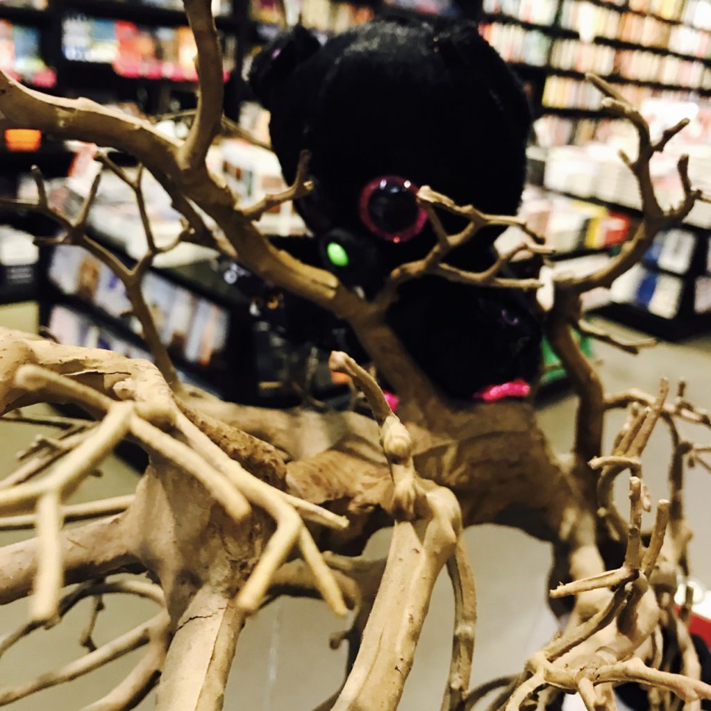
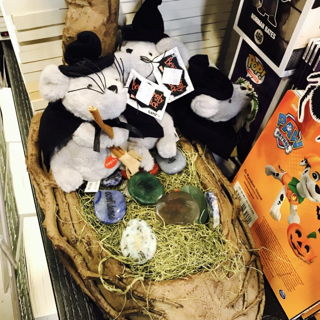
Here are four photos showing terrific attention to detail in a small Halloween themed display in a bookshop I visited earlier this week.
Not only is the display eye-catching, it makes excellent use of a small amount of space and it pit shed products from a range of different categories. In fact, I count six different product categories represented.
This is a smart display, especially for the space it takes. Rather than the old-school big and bold aisle end display newsagents bare still encourage to create, here is a small format display in a tight space. It is a display that represents ts a narrative and this is another reason I think it is smart.
I hope you find it as inspiring as I do.


Not impressed. Looks a dog’s dinner to me and the staff picks sign is not relevant. Maybe something is lost in the photos.
I much prefer the cleaner lines in your post of 29th from same store. No suggestion of jumble sale here. Entices me much more.
Interesting that this store is now revealed as a bookshop. Images are misleading, I had thought upmarket newsagent in good retail area.