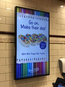
 I love the creative for the BTS promotion in Baker’s Delight stores. In addition to the on-screen promotions there was a banner at the back of the counter and a pitch at the front of the counter. All visuals were consistent. This visual consistency is important in driving shopper engagement.
Their use of colour pencils was smart as it provided an appealing base for the marketing collateral. I also love the cheerful headline for the collateral.
Well done Baker’s Delight!