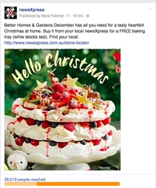
 Using a close-up photo of part of a magazine cover can get you a significantly better result from a Facebook than using the whole post. Take the current issue of Better Homes and Gardens. While it looks terrific, a close up of the pav was the hero so that is what I used for a post yesterday. And it worked a treat. Hundreds of shares in a few hours – extending the reach of the post beyond the like base of business I was promoting.
Here is my marketing tip: If promoting a magazine, look for the image that differentiates your pitch from what others will do to promote the same title. If you pitch the whole cover you are not offering a differentiation for your business.