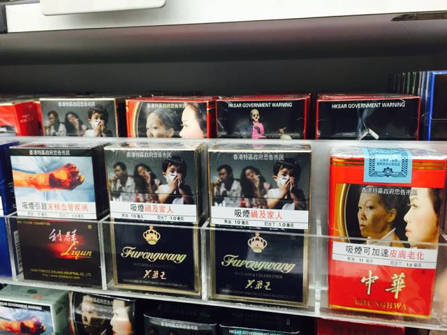
While in Hong Kong for the Gift Fair this week I have noticed how cigarettes are packaged and presented. While there are warnings, brands are noticeable.
Here is one shelf of a display in a c-store.
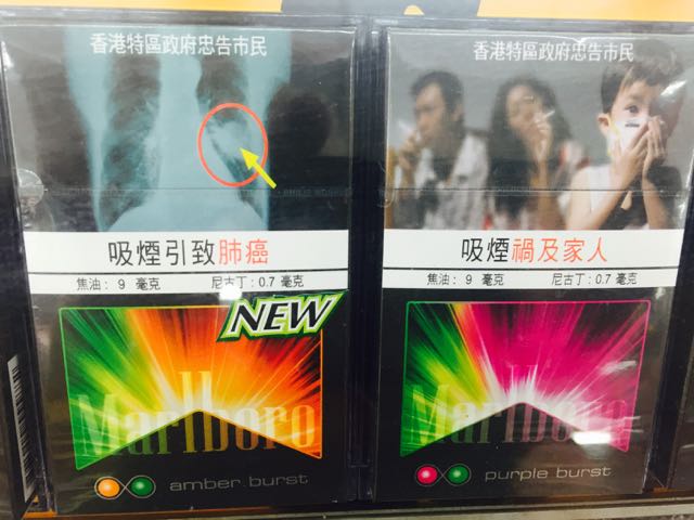
Here is a close-up look at the Marlboro amber burst and purple burst products. While there are warnings on the packs, the brands are the focus with strong design elements to make them stand out and appeal.
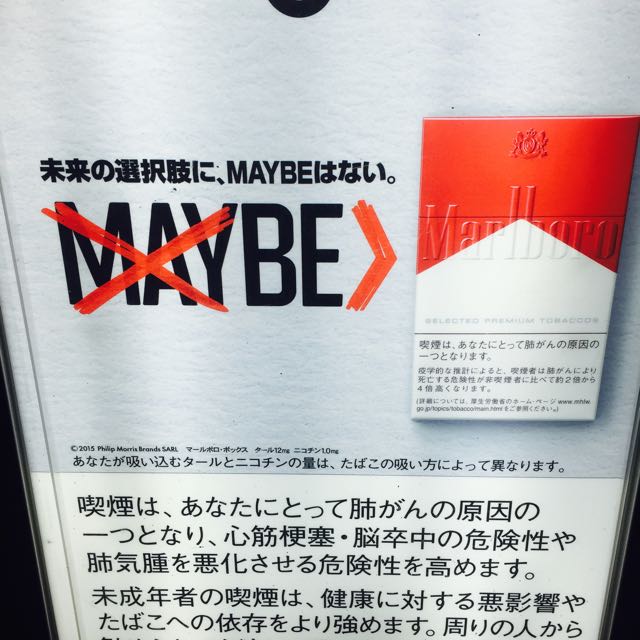
Here is a poster I saw in Japan a month ago. It remind=s me of the selling of cigarettes in Australian 20+ years ago, when the brands were pitched as aspirational.


