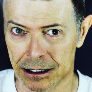
 More and more I am using photos of parts of magazine covers in marketing of magazines for the newsagency. Rather than all the text and masthead pulling focus from the hero of the cover, the food dish or the icon, such as David Bowie, I am finding it more effective in attracting interest in a niche title by decluttering the image.
While most retailers promoting magazines online use the full covers, I am finding the use of tight shot photos of part of a cover works better. I say this based on feedback. It is certainly a point of difference at the moment.
This David Bowie photo from a magazine in February is a good example. The image is stunning, haunting. It is more effective in this form for online marketing than on the full magazine cover.
If you are promoting magazines on social media you need a point of difference to drive attention. Doing what everyone else does dilutes your effort.