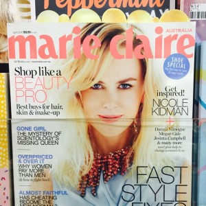
 I like the ad inserted in Marie Claire magazine with the gold bubbles appearing out the top. It is different to the usual inserted card or ad, this should attract attention and get people noticing the ad. I also like the low profile – that it is not obscuring too much of the title behind.