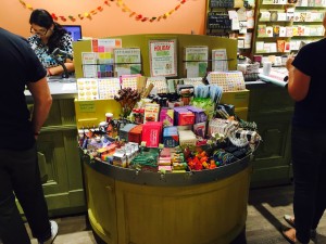
 I love the way this gift and card shop in the US handles an impulse purchase pitch at the counter. It makes good use of space between two customer serving locations, using what would otherwise be dead space. It pitches products easily purchased by those close to the counter.
I think it is important the unit is curved. That makes it easier to navigate, easier to shop and less visually harsh in my view.
It is the type of unit that could be made and pushed up against the counter without being built-in, without costing too much money.
Many newsagency counters I see are old school, pitching a product mix that has not changed in years, achieving little in the way of impulse purchases at the counter, most likely not contributing appropriately for the premium space allocated.
The approach shown in the photo shows how one retailer has created new space to achieve a better financial return from expensive counter space. I think it is worth a try.
My advice to any newsagent considering something like this is – don;t use a shopfitter and their shares are likely to be considerably higher than if you purchased the item from a cheap furniture place or had a local hippie knock something up.
Spend as little as possible to trial this or any other similar future idea you have for your business.