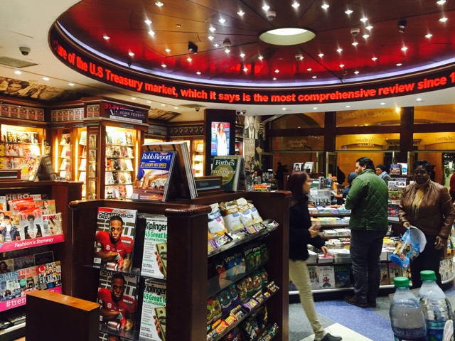
The Hudson News at Grand Central Station has a busy thoroughfare on either side. The store designers embraced this with a circular design while at the same time creating a space that brings you in and makes news the feature – with the ceiling news ticker and TV screens dotted throughout with current commercial new playing.
I love the feel of this shop. It is perfect for its unique high traffic location.
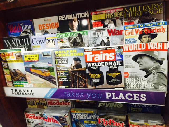
I get that most of us could not justify this type of fit. That said, there is plenty to learn from segmenting magazines through to making the range enticing. Take a look at this photo showing how they pitch a segment:
I love the line: Takes you places.

