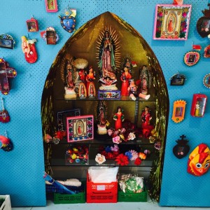
 I took this photo in a funky shop last week and share it here as inspiration. To provide focus to some products they created a wall in front of the wall, to make for what looks like a shrine. They lined the cavity with gold paper and painted the new wall a nice contrasting blue. The result was a display you could not miss as you enter the business.
Ignore the products they are displaying and focus on the idea – of creating a feature space for a low cost, creating a space everyone entering the business notices as it is different, unexpected.
This is a perfect, simple and low cost way to get people looking at a category of products you want to feature. What is even better is that the materials you use can be repainted and used for another display at a later stage.
On the display itself, the more we make our businesses look less like newsagencies the better for this helps shoppers shed newsagency related perceptions when they shop with us.