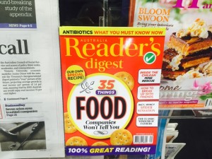
 I decided to give the latest issue of Reader’s Digest a few days next to newspapers to see if it lifts sales. I did this because I think this cover is particularly good – id is eye-catching and easily understood. I created the space by moving papers across by 10cm. I’ll check Sunday and if sales justify the placement we will keep it here for longer.
Reader’s Digest is a title that sometimes (cover depending) responds well to promotion.