 Standing in front of your newsagency or at the entrance to the shop, how many messages are you pitching to your customers? Do these messages contradict each other? Are the messages connected in any way? Could your customers be confused?
How we dress our shops is one of our most important marketing activities. From product placement to displays to price offers to posters to traffic pathways … how we dress our shop is a vital marketing activity.
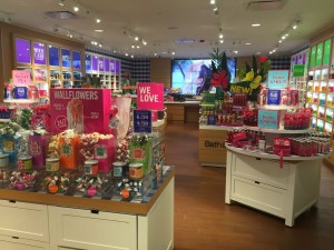
The photo is from one of several Bath & Body Works shops I visited in the US a couple of weeks ago. Their messaging was clear and co-ordinated. This is somewhat easier for them as a relatively narrow category retailer. In today’s newsagency this is challenging as we are more general in the categories we pitch.
Greeting card, magazine and stationery products are colourful in themselves. we tend to enhance this with signage and other collateral supporting each, adding to the colour volume. Next we pepper the store with posters, displays and signs. No wonder some promotions do not cut through – shoppers cannot see them for all the visual noise.
I think a less is more approach is appropriate. Cut back on your noise. Be clear and focussed in your messaging. Provide a visually calmer shopping experience to encourage your shoppers to enjoy your space more.
Look at the messages you controlling those in front of your shop or just inside your doors. Count the different messages. Cut back and track the impact this makes.
Visual noise for the sake of noise is not a good strategy.