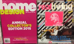
 I noticed Real Living in the sea of magazine colour in one newsagency and it stood out. In another shop they had it next to the bring Home Design and that title pulled focus from Real Living. In this situation I’d not place the titles next to each other so they are more noticed. However, I know others would try and colour block to make a bolder statement. Whatever you do, make thoughtful choices rather than plonking a magazine out without considering the cover and how you can best leverage this.
The covers of both these titles look good. Real Living looks especially different.