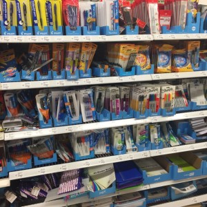
 The stationery department in Coles supermarkets has a consistent look and feel based on a Coles image ahead of the brands on offer. Look at the photo and see all suppliers are required to place products into CDUs with the same colour.
This Coles requirement helps to bring visual consistency to the stationery offer in Coles supermarkets. It speaks to the power of Coles that it can get suppliers to provide business specific display units such as these which place Coles consistency ahead of their brands.
The CDUs themselves facilitate orderly placement of stock on the shelves which is important in such a big business.
In my small business newsagency, I prefer to work with brands and for the power and value of those brands to shine through with their own corporate image. I don’t require them to hide behind my image veil.
Well-known corporate brands help drive traffic for us and facilitate shopper confidence. This is one reason I think major stationery brands ought to be more engaged with newsagents – we are more likely to endorse and support their voice above our own.
You are right about the power of coles. This single colour block was brought out by coles to call out their special occasion displays like back to school etc. They had a belief that the normal branding of brands got lost in a store full of normal branding.
I wholeheartedly agree with you Mr. Fletcher. At a time when our competitors are mostly offering homogenised displays and home brand products, the offer of quality branded product our Customers find in Newsagents reaffirms our connection with our Customers.
It all looks pretty messy to me in this picture. I find that they have so much stock in is overwhelming for me. I had the same thing said to me with back to school. A lot of my customers had tried buying in big centres and found it too crowded, too hard to find what you wanted and no one to help you. I don’t like this type of display.