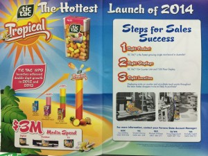
 The double page spread in a convenience magazine is an excellent example to other publishers on how to launch a new line to newsagents and other retailers.
They tell us their ad spend and where they will spend it. But it’s their steps for sales success that I like the most, especially how they show the right location. A picture really does speak a thousand words.
How many times do you get a flyer with magazines telling you this or that and end up binning it because you don’t have time to read the essay.
I’d urge all suppliers to newsagencies to look at how Ferrero has pitched the new Tic Tac line and how they have communicated and encouraged retailers.
Click on the image to see the details I mention.