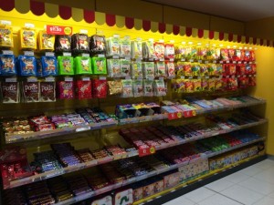
 This photo shows the display of packaged sweets at the Zoodle store by WH Smith at Melbourne airport. I love the red and yellow striped canopy above the product as it draws attention to this rear-wall display. It visually anchors this department within the business. In fact, anchoring departments is done well in in this Zoodle shop. Browsers can easily identify each section. This is important in retail.
Take a look at your newsagency: do you have departments visually anchored? Are borders from one department to another clear? While it can be appealing to have departments and sections blend into each other, this can hinder the browsing experience and thereby affect revenue.
Attention given to shop layout can improve sales regardless of the age of the shop-fit.