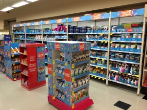
 Check out the Back to School display in one inner-city Coles outlet I visited a couple of days ago. Click on the image for a larger version – you’ll see more of their range in detail. What I like is the visually consistent message. Back to School owns this space. The in-store collateral connects with their out of store advertising and marketing – all integrated.
I have posted this photo to provide a reference point for newsagents doing back to school, to ask whether your display is as consistent and as visually impactful. I think it’s important we compare ourselves to those competing with us.