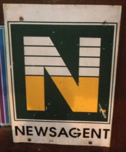
 The version of the N displayed in front of a newsagency I passed recently is the original version from when it all started, when the N was created as a logo for distribution newsagents. It’s visually out of date. That it can be used reflects a lack of discipline around the logo. This is just one reason the N in irrelevant today.