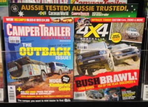
 I like the multi-title header from Bauer promoting four of their titles. I like the Aussie pitch. I also like the listing of the mastheads on the backing card as this guides placement. The only challenge with header cards like this is the space they steal form the titles behind.