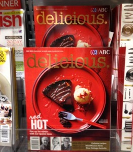
 The cover of the latest issue of delicious magazine is stunning. It cuts through against the colour in a busy magazine department. The use of red is inspirational. I can stand at the entrance to the aisle with the title and see it from metres away – it’s the title I first notice. We have the full cover on display as anything less dilutes the value of what they have created.
The best they have ever done. We have a poster display outside shop 2 metres high and it looks fantastic.