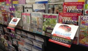
 What started out as lazy collateral placement has proven to work when promoting magazine competitions. Take the latest Win a Car collateral from Pacific Magazines and the holiday promotion from Bauer – using the header cards in this way – sticking out – draws attention. I’ve see it work myself. And that’s the battle – getting people to notice a promotion in the sea of colour that for many blends into a visual blur. So, we often use promotional header cards in this practical way – sticking out and hopefully getting more noticed than a neater approach.