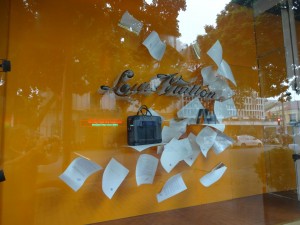
 Check out the back to work window display being rolled our by Loius Vuitton stores. It’s visually stunning – like all their window displays. It is also perfectly connected to the season without being all about price or looking boring like most BTS VM displays look.
While Louis Vuitton sells high end bags with excellent margin, I do think we can learn something from this display. It presents a strong visual connection with the season which is enjoyable. Like any good display, your eyes are drawn to this window. That’s the first step to getting you ton consider the products on offer.
We often judge our displays against other displays in newsagencies. I think we need to judge them against other retailers as these are our real competitors. This is where we, each of us individually, need to make visual merchandising choices that are appropriate to our specific business situation.
For example, do we display to compete with a supermarket? … a department store? … a card shop? … some other specialist retailer? I think these are interesting questions as I certainly believe that the days of displaying in ways traditional to newsagencies are no longer relevant to us.
Click on the image for a larger version.
i don’t see this as eye catching at all , it looks quite boring , maybe in oerson it looks better
It looks like the wind blew the papers off my desk.
And it draws your eye from across the road.
Quite honestly I think the name newsagency is also irrelavant and from the dark ages.
I was under whelmed until I enlarged the picture. I can see it would really draw the eye when viewed first hand.