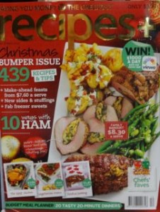
 I love the cover of the latest issue of recipes+ magazine. It stands our from the covers in our food section. For us it stood out enough for us to move the title from a rear pocket to the front. We are always on the look out for covers that reach out from the shelves, away from other titles. We have it in a full cover prime pocket in food.