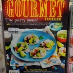
 I like the cover of the latest issue of Gourmet Traveller magazine. It’s got good visual cut-through and stands out from the crowd of food titles in-store at the moment. We have it placed to make sure that the full cover is on display. the contract in colours from the masthead itself is terrific.