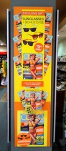
 I love the bright look of the latest Cleo magazine. The terrific cover and bright collateral accompanying it was reason enough for the team at one of my newsagencies to place this out the front, facing into the shopping mall.
I love how they personalised the display with orange and yellow card and used the cover run-ons at the sides to add impact to the display.
While on the weekend I said newsagents should free their team members to create displays without using supplier collateral, this display is an example of excellent use of the collateral … especially since it brightens the mood in the middle of what has been a cold Spring.