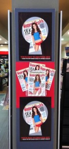
 I like the collateral promoting the latest issue of Women’s Health even if it may upset some of our older customers.
Your key to better sex is as attention-grabbing as they come. The keyhole image is smart.
We have the title on show on a pillar facing into the shopping mall – yeah, we want to get the attention of shoppers outside the newsagents and get them thinking about sex and our shop. And why not? It changes things up from the usual view of a visit to the newsagency.
Yeah, I like this campaign for Women’s Health.