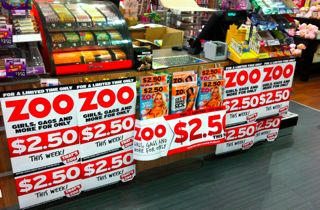
 I love the collateral for the latest issue of Zoo. It’s simple, providing good visual cut through. It’s also clear in its goal. Both factors help us in our environment of considerable competition for attention.
I also love the display created at the counter by one of our team members. This is an excellent place for the title. The display rocks!