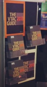
 I like the look of THE VTAC GUIDE 2013. Visually, it’s a nice departure from past guides. The new look has given the team in one of my newsagencies an opportunity to take a more stylish approach to promoting the title.
Stylish is not word I’d use in considering past VTAC GUIDES. This year is different and it looks good. This is important in retail in that we like to sell products that look good. This one does.
So, we are going out early with the THE VTAC GUIDE 2013 out the front of the shop somewhere people can easily see it and visit the shop as a result. The display in the photo is facing into the mall where passers-by can see.