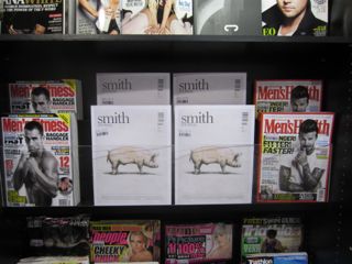
 We are still seeing good results from the second issue of Smith Journal. This is in part to our co-location strategy. The photo shows the second location we have for the title – this with men’s health and fitness titles. Ad the photo shows we have gone for a symmetrical display that makes Smith the visual hero. It’s working a treat from this location.
I want to grab as much business for Smith Journal as I can because it sells to a demographic which is vitally important to us. The more younger shoppers, 20s and 30s, we can satisfy the better in my view. Smith is certainly in a niche on its own and for this alone deserves our active support.