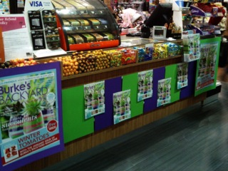
 Check out the display promoting the latest issue of Burke’s Backyard created by the VM genius Renee at my Watergardens newsagency. I love how it appears to wrap itself around the counter. It is certainly more visible than would be the case of we just put the magazine at the counter. This display also demonstrates the value of choosing background colours to promote a cover or a poster from the publisher.
I am confident that the visual power of the display will drive an excellent sales result for us an ACP Magazines.