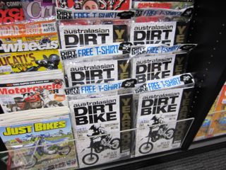
 I love the look of the latest issue of Australasian Dirt Bike. The monochrome cover cuts through against the colour from nearby magazines. We are leveraging this by giving the title double the usual space. This makes it more noticeable and will hopefully drive additional sales for us.
While only a small move, this is the sort of move we relish as it relies on what we bring to the table, it leverages the point of difference available to every newsagent.