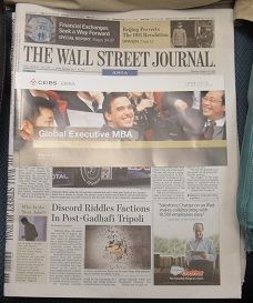
 The ad I noticed on yesterday’s copy of The Asian Wall Street Journal was done in a way which is okay. While it did cover editorial, it was not stuck on. On the side it was stuck but no adhesive on editorial content. The ad was easily flipped across.
Also, there was a perforation at the glue line making removing the ad a dream. The other aspect of this ad placement was that it did not interfere with the masthead.
While I remain unhappy with ads which block access to headlines, what I saw on The Asian Wall Street Journal better than what I see in Australia.