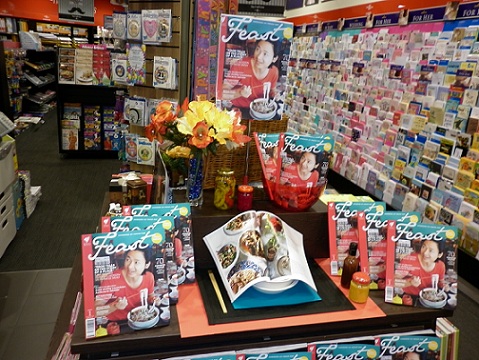
 Check out the refreshed display promoting Feast magazine we have out this week. This kicks up the offer to a new level, connecting with the love of food reflected in the pages of Feast. I like the display because it goes beyond the traditional flat magazine display. It invites browsing, especially the open magazine in the bowl on the table.
I thought the cover for the launch issue was disappointing. This is a very nice display Mark and kudos to your team for always trying new things, but how long would you leave this up for? I don’t think I could justify such a premium table space for the return on ‘just’ a magazine – not when certain gifts, toys or books would earn far more. Having said that we did devote premium space to the Baked & Delic. partwork and it worked well.