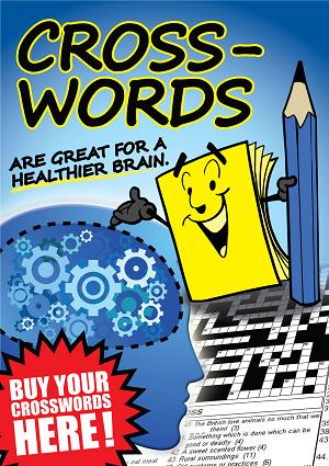
 This is a draft of a crossword promotion poster we are developing to promote the category and share with other newsagents. While not yet completed, I thought I would post it here for feedback.
What I am not sure of is the hyphenation of crosswords – it does not look right to me. Fitting crosswords is a challenge though.
Once done, I will post a link to the art on this blog so people can download it and print locally – A4 or A3.
It is important for us to promote categories of magazines and not just single titles as we do today, especially categories in which newsagents specialise like crosswords.
The hyphen is wrong, of that there is no doubt. One option – write ‘crosswords’ in two planes with a common ‘o’, i.e. ‘cross’ goes horizontal, ‘words’ drops down through it and shares the letter o. Any crossword fan should be able to read that!
You could also go for a writing the whole word vertically, not sure if that’d be better or not.
The hyphen has to go.
I would also be tempted to change the colour to move away from the current scatchies by the same name.