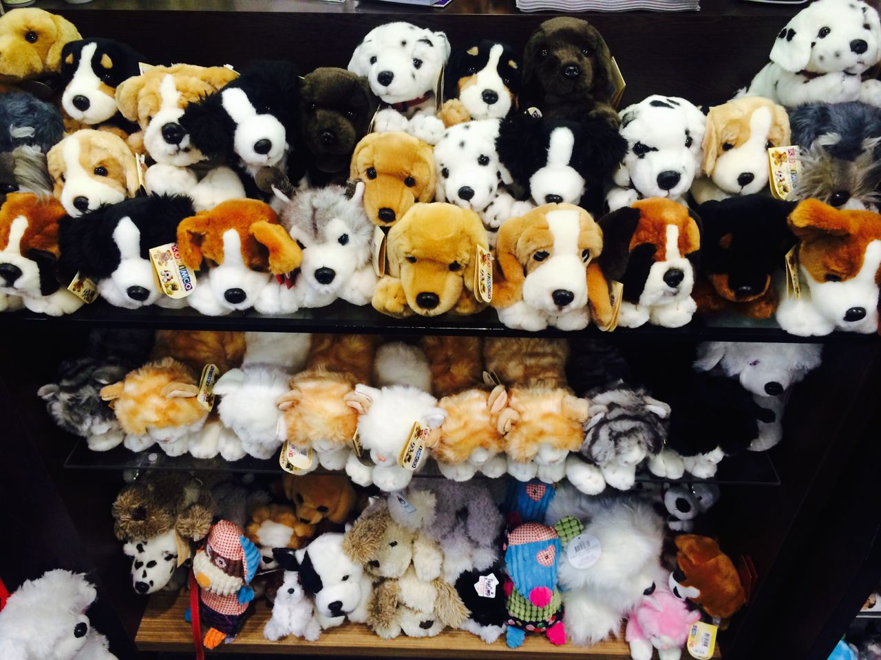
 Yesterday I had a crack at the dog and cat plush at the counter in response to a comment by BrettS. This layout is neater which should make it more appealing to shoppers. As happens when you’re working with products – customers engage and sales follow.
On the placement of plush at the counter as we have it, it works.
Now that looks really good.
I wonder if it sells more.
I kinda liked the jumble of the initial display – looked like the little critters were jumping around all over each other. However, I also accept that it might have struck some people as looking a bit ‘junky’. It will be interesting to hear if you think a tidier display makes any difference.
While I like the look of the tidier display, I don’t think one approach works better from a sales point of view over the other.